Wednesday, January 26, 2005


This is a practice piece that I did in a calligraphy workshop this past weekend taught by Sharon Zeugin. The letters are sans serif Romans written with a Mitchell #6 nib using Winsor & Newton gold gouache (tube) with the tiniest drop of white gouache added to the mix. The paper is Canson Mi-Teintes, and the little drawing at the bottom is done with Prismacolor pencils. Roman capitals are notorious amongst calligraphers as probably the most difficult letters to execute properly. Once you are able to make each one reasonably well, the next hurdle is optical spacing. Most non-calligraphers don't appreciate how hard it is to learn to do these letters well because we've all been writing them since we were 5 years old. I've been actively studying calligraphy for about 20 years, including a number of Roman workshops with a variety of instructors, and I still feel like a novice when it comes to these letters. Posted by Hello

Tuesday, January 25, 2005

"Shoulder the Sky" by Anne Perry


I had previously read two other novels by this author; one featuring Inspector Monk and the second, Charlotte and Thomas Pitt. But this historical mystery I enjoyed more than either of those. It is set in 1915 before the U.S. entered WWI, during the time when England shouldered much of the burden in defending Europe from German aggression.

I listened to much of this unabridged audio version while traveling back and forth to the first weekend of Sharon Zeugin's 3-part workshop in Houston. I did not realize that this was the second book in a series until it abruptly ended without divulging the identity of the "Peacemaker". This master manipulator appeared to be an intimate of both the King and the Kaiser, and he sought peace at any price. His original plan would have allowed England to regain her American colonies in exchange for letting Germany have dominion over the rest of Europe. When this plot was discovered, and the war began anyway, he continued his machinations by using journalists to undermine public support for the conflict, and even going so far as to murder anyone, even a friend, who might threaten to expose him.

The main characters are the Reavley siblings: Joseph who is an army chaplain based in Flanders; Judith a volunteer ambulance driver; and Matthew an intelligence officer. Much of the story centers on Joseph's ethical need to find out who drowned an arrogant, thoroughly despicable reporter. He finally manages to solve this mystery--much to his sorrow--while also discovering that everything is not as black and white as he had once thought.

The author has done an excellent job of conveying the horror of the battlefield and also the comradeship of the ordinary soldiers. I'll be very interested to read future books in this series, as well as the one that came before this one--"No Graves As Yet".

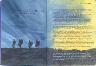
I had prepainted the background (the blue and yellow) weeks before I even began this particular book. I have just been using the pages in the journal in order as I finish a book, and so far I'm amazed at how each background seems to fit the book, but this one is so on target that it's positively eerie. I enlarged the silhouettes of the soldiers from those on the book cover and painted them with Americana brand "Graphite" acrylic paint. This was also used for the battlefield; just dabbing it on with a 1/2" flat brush to create the rubble. The black text was written with a new pen that I bought yesterday to try out. It is a Pentel EnerGel, and it worked great on the acrylic paint. The white text was written with a Gelly Roll pen. Posted by Hello

Friday, January 07, 2005


When the doors are opened, the burqa-clad women are revealed. The text underneath says, "but 500 years later, there's still this..." This was the last spread that I did in Dolores' book on women. Gee, I always thought the Dark Ages came before the Renaissance! Posted by Hello

The top text on this page says "Women have come a long way, baby..." The door was stamped and colored with chalk and blending fluid in a waterbrush. Posted by Hello

Wednesday, January 05, 2005

"Hadrian's Wall"


This was a fast-paced, well-written story that related one of the last clashes between the Celtic tribes and the Roman invaders of Britannia. It was set in 368 A.D. at the great wall that had been built to mark the end of the Roman empire. The main characters were:
     Valeria - a senator's daughter who was the pawn in an arranged marriage
     Arden Caratacus - her lover and a Celtic chieftain
     Galba Brassidias - a Machiavellian tribune whose ambition and cruelty was without limit

The author, William Dietrich, used an interesting device whereby the facts gradually become known in flashbacks as a Roman inspector tries to piece together what actually happened by interviewing various witnesses to the unfolding events.

Many years ago I began recording the title, author, and date of each book that I read. I put this into a Word table  so that I could sort it by each of those fields. I found this helpful to take with me to the library or bookstore when my short term memory got so bad that I couldn't remember whether or not I had already read something. Just a month ago, it occurred to me that I should start keeping a summary of the plot and my impressions of each book. I decided to do this in an art journal format in a composition notebook. The pages were first painted with a mixture of acrylic paints, and then I drew the wall with colored pencils and did the lettering with a .8 Copic Multiliner pen. The Celtic cross is a rubber stamp image. I had a lot of trouble getting this ready to post because it was too big for the scanner to read the whole spread. So I scanned the two halves separately and was struggling to learn enough about Photoshop to piece them together. A new online friend came to my rescue when she told me about the "stitching" capability in ArcSoft's PhotoStudio. Thanks, Janice! I didn't get it lined up absolutely perfectly, but it's close enough to suit me.
Posted by Hello

Tuesday, January 04, 2005

"The Rottweiler" by Ruth Rendell


This tale of a serial killer takes place in a London antique shop whose owner is the landlady to a group of odd characters, one of whom is the murderer. We soon know who he is, but the mystery is why ! A perfume is the catalyst that sets him off. The other characters' stories are a running thread that reveal themselves bit by bit. I never made any sense out of the title. It didn't seem to have any connection to the story at all--not even figuratively. I would have called it "Libido" after the scent.

This is the first page in my reading journal. The background was done with the cheapo acrylic paints that I love to use so much. When I first decided to start this journal, I went ahead and painted a bunch of spreads with random colors. I'm just using the pages in order as I finish a book. So far, the colors seem to go well with the mood/setting of the books. I'm beginning to learn that you don't have to plan every detail ahead of time. A little serendipity can be a wonderful thing. Because the background was dark, I used a white Prismacolor pencil for most of the writing, and the two people are cut from advertisements. Posted by Hello

The fifth spread in the book has the text written on a piece of scrapping paper that was in the sale bin at Novel Approach. I think it goes so well with the sky that Leonardo painted. I love it when I am able to find the perfect piece of paper in my stash. Mona Lisa is adhered to a gorgeous piece of Stardream cardstock which is a rich brown with iridescent copper highlights. Unfortunately, it just looks dull in this scan.Posted by Hello

This is the 4th spread in the book. I painted these pages with Anita's Antique Gold acrylic paint, leaving some of the creamy white page showing. Then I wrote out the text on olive green scrapbooking paper and adhered the portrait of Ginevra de' Benci. Posted by Hello

This is the third spread in the book. I painted the pages with robin's egg blue acrylic paint, and when that dried I swiped it with several colors of Colorbox fluid chalk ink pads. Then I cut out the woman's portrait and glued her in place. It doesn't show very well in the scan, but I mixed some very fine gold glitter with Perfect Paper Adhesive (matte), and dotted it around on her hair jewels and necklace with a toothpick. I was really surprised how great it looks. When you're looking at it in person, the necklace, especially, has a 3-D effect--like you could almost lift it off her neck. The writing was layered over a piece of mulberry paper that is printed with gold, silver, and copper. Posted by Hello

Monday, January 03, 2005


This is the second spread in Dolores's book. It illustrates how paintings of saints were the forerunners of Renaissance bridal portraits. Posted by Hello

This is the first spread I did in my friend Dolores' altered book. The topic I chose to share with her was how women were portrayed in Renaissance portraits, as well as how they were treated overall.  Posted by Hello

Giovanna

I made the frame for Giovanna's portrait out of strips of corrugated cardboard, sprayed gold, and trimmed the edges with decorative scissors. I made her necklace with tiny gold lame' cord and tied on a red jewel (actually a translucent bead.) The sign on the frame was stamped and embossed with gold powder. I cut out the profile on the right side, wrote on it with McCaffery's ink and a Nikko pointed pen nib in a simplified Spencerian script. Then I aged it with Judikin's color duster brushes and Adirondack inks in butterscotch, caramel, and currant. Doesn't it make you hungry to read those color names? The profile is actually just the shape of a face which overlaps the next page, but I had to put a piece of black paper underneath it for scanning purposes.

Flickr

This is a test post from flickr, a fancy photo sharing thing.