Friday, November 17, 2006

Reading Journal: "Snow in August"


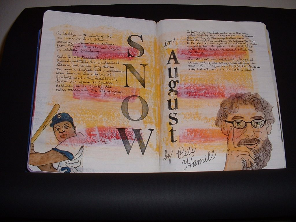
In Brooklyn, in the winter of 1946, an 11-year-old Irish Catholic altarboy encounters a refugee from Prague and the two begin an unlikely friendship. Rabbi Hirsch teaches Michael Yiddish and tells him fantastical stories, while the boy hones the man's English and indoctrinates him in the wonders of baseball while they breathlessly follow the feats of Jackie Robinson as he breaks the color barrier in the big leagues. Unfortunately, Michael witnesses the near fatal beating of a shopkeeper and draws the enmity of the perpetrator down on himself and his mother. He refuses to "rat" to the police even after he is severely beaten himself, but struggles with what to do until Rabbi Hirsch is almost killed by the thugs. I'm still not sure what really happened at the end of the story. Was it only in Michael's imagination? Did the Falcons self-destruct, or was the Golem real?

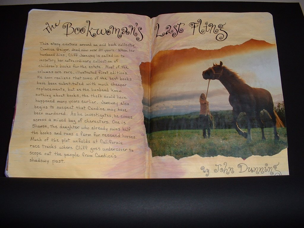
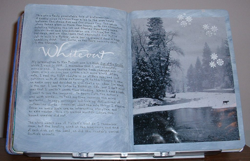
This is quite a different layout for me. As I've said more than once, I prepaint my pages...and honestly, some of them are so strange that I don't see how I'll ever use them for a book review. This is certainly one of the most unusual. I had painted the centers of the pages bright yellow and topped that with those six red swashes. When it was dry, I squirted a bit of cream paint around the edges and as it began to run out, dry-brushed it over the top of the yellow and red. Serendipitously, the hot colors turned out to be reminiscent of the sweltering summer at book's end, and the overlay of cream could be taken for snow.

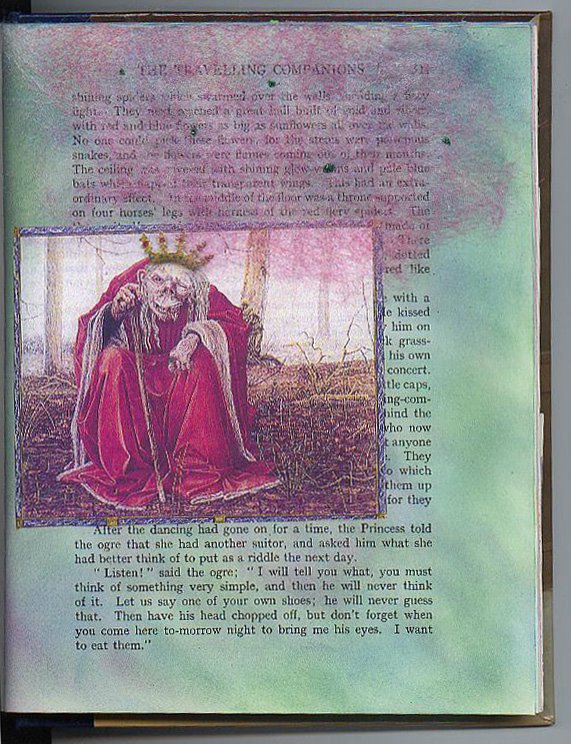
The illustrations on this spread are another departure from what I normally do. My drawing skills are rudimentary, to say the least. I can't sketch anything without assistance. In this case, I found some photos on the web. Printed them off and laid a piece of tracing vellum on top. Using a waterproof Pitt pen, I traced the outlines of each. Then I laid on color with Derwent "Inktense" pencils and washed them with a Niji waterbrush. Once they were good and dry, I cut around the figures and ran them through the Xyron before applying them to the corners of the pages. Because the vellum is translucent, the colors of the background show through and the drawings appear to have been done directly on the pages.

Reading Journal: "The Bookwoman's Last Fling"


This story centers around an avid book collector, Candice Geiger, dead now over 20 years. When her husband dies, Cliff Janeway is called in to inventory her extraordinary collection of children's books for the estate. Most of the volumes are rare, illustrated first editions. He soon realizes that some of the best books have been substituted with much cheaper replacements, but as the husband knew nothing about books, the theft could have happened many years earlier. Janeway also begins to suspect that Candice may have been murdered. As he investigates, he comes across a mixed bag of characters. One is Sharon, the daughter who already owns half the books and runs a farm for rescued horses. Much of the plot unfolds at California race tracks where Cliff goes undercover to scope out the people from Candice's shadowy past.

As in almost all of my reading journal spreads, this background had been painted without any book in mind. I found this photo on the cover of an investment newsletter and thought it was a good illustration for the story and the colors meshed well with these particular pages. I had made the pinkish strokes outward from the center just because I happened to have some of that color left on the brush after painting a totally different page. And as is often the case, it helped to tie the photo to the rest of the page since it's a tint of the rusty pink color at the top of the sky.

I was just playing around when I wrote out the title and author. All those curliques were a take-off on the word "Fling."

Monday, October 30, 2006

Reading Journal: The Romanov Prophecy


After the fall of communism, and weary with a succession of failed governments, the Russian people have voted to restore the monarchy. Miles Lord, an African-American lawyer, has been hired by a mysterious cabal to pave the way for Stefan Baklanov, a distant Romanov relative, to ascend the throne. When Lord discovers documents hinting at the survival of two of Tsar Nicholas's children, he finds himself marked for death and on the run. Aided by a circus performer, Akilina (the "Eagle"), Lord follows a series of clues as he attempts to unravel one of Rasputin's last prophecies, in which Lord himself plays a crucial role as "the Raven."

The background for this spread was one that I had painted ages ago, and just kept skipping over because it really didn't look right for any of the books that I wanted to review. Actually, I thought it was pretty drab until now. It never ceases to amaze me how just the right picture can improve a background. The onion domes of Red Square were from the travel section of the Sunday paper and I had saved them for years, not knowing what I would do with them. I just knew they were too pretty to throw away. What really made them work on this page was cutting away the background of the photo, so that my painted pages became the sky. It was a little tedious cutting around those tiny crosses but Fiskars micro-tip scissors were a huge help. I used matte medium to adhere the image, brushing it on a bit at the time. I've found that it's a mistake to apply any adhesive all over the back of a cut-out if it's from thin paper. The little parts will curl like mad and drive you insane. I position the image exactly where I want it on the spread, and while holding it in place with my left hand, I use a flat brush to apply the medium in one spot, smooth it down and continue adding medium until the whole thing is stuck in place. The beauty of matte medium is that it doesn't show like regular glue when any oozes out. And it brushes on more easily than glue.

I wrote the title in Gothicized Italic, using Schmincke black gouache and a Mitchell #1 nib. The author was written with a .8 Copic MultiLiner and the summary was done with a Uniball Vision micro pen.

Thursday, October 05, 2006

Reading Journal: The Lighthouse by P.D. James


Combe Island off the Cornish coast has a blood-stained history of piracy, but now, privately owned, it offers respite to overstressed people in positions of high authority who require privacy and guaranteed security. But this peace is violated when one of the distinguished (but thoroughly unlikable) visitors is found hanging from the railing of the lighthouse. Suicide was briefly suspected but it soon becomes apparent that he was murdered.

Commander Adam Dalgliesh is called in to solve the mystery, but at a difficult time for him and his depleted team. While he is uncertain about his future with Emma Lavenham, Detective Inspector Kate Miskin has her own emotional problems, and Sergeant Francis Benton-Smith is worried about proving himself. As they try to unravel the complicated motives of the multiple suspects, there is a second very brutal killing; and the whole investigation is jeopardized when Dalgliesh contracts SARS from one of the suspects.

The background for this spread was painted with Anita's "Silver" mixed with a small amount of "Metallic Sapphire". I was afraid that it might be difficult to write on, but I had no trouble writing out the summary with a Uniball Vision Micro pen. Despite what shows in the picture, the writing is very black and crisp. The title/author was written with a medium size Pilot Permaball. This was a new pen that I was given by Sandy Odom when I went last month to Austin to teach a class on making backgrounds. It writes permanently on all surfaces, and is acid-free, waterproof, fadeproof and smear-proof. When I heard that, I figured it was the thing to try on this shiny metallic surface. It wrote easily and dried quickly. Nothing came up when I cautiously wiped my finger over it. If it only came in a smaller point, I would be in love!

You can barely see it here, but the crossbars of the "H"s and the "A" are colored in with various colors of RoseArt gel pens for a bit of pizazz.

Sunday, October 01, 2006

Sex Wars Revisited


This historical novel by Marge Piercy is set in the decades that followed the Civil War. It is a fascinating account of the women (Susan B. Anthony, Elizabeth Cady Stanton, Victoria Woodhull, & Lucretia Mott) who passionately fought for the right to vote, the right to own property and to manage their own money, and to have control over and understanding of their own bodies.

The spread for this book had never seemed quite complete, so I finally decided to do a little more work on it. The differences are subtle, but I do think they make it look better. I'm posting both the "before" and "after" together so you can more easily compare them. The blah background had always bothered me the most, so I added a little color to it by pulling a blue chalk inkpad across it in places and blending on to the women's pictures. Then I used the darker end of a "Platinum" Brushables marker to shadow the letters in the title, and finished by lightly defining the space between each letter and shadow with a black Pilot P-500 pen. As a calligrapher, I hand write most everything in my journals, but the letters for this title were done with rubber stamps.

Friday, August 11, 2006

Reading Journal: Nevada Barr


About 6 months ago, I had the distinct pleasure of discovering Nevada Barr's wonderful novels that are set all over the U.S. in a variety of national parks. Having been a park ranger herself, she has a real feel for nature and is able to convey the wonder and majesty of some of our most awe inspiring lands while also unreeling some rollicking good mysteries. Once I had read my first book by her (which just happened to be the last one she'd written,) I couldn't stop until I'd read all 13.

Since I'm so far behind in doing spreads for the books I've read, I decided to make just one spread for all her books. I used pages that I'd previously painted with Fawn, Eggshell, and Forest Moss because I thought the colors were nice and earthy looking. I made columns for title, setting, copyright date, and a 2-line summary of each story.

Sunday, February 12, 2006

Reading Journal: Whiteout


This was a fairly predictable tale of bioterrorism. A deadly virus is stolen from a lab in the wee hours between Christmas Eve and Christmas Day. The whole story takes place in those few hours, with the characters rotating between the lab and Stanley Oxenford's home. His children and grandchildren are visiting for the holidays, and we soon learn that reprobate son Kit is out to ruin his father, while saving himself from a huge gambling debt. Toni Gallo, as the lab's security chief, is the heroine.

My introduction to Ken Follett was his book "Eye of the Needle", which I read in 1979. I remember that I was absolutely mesmerized. I suppose my tastes have changed over the years, or his writing has gotten a bit more bland. At any rate, I read the first chapter or so of this one, and lost patience with it. After returning it to the library, I saw an audio copy and decided to give that a go. When I'm stuck in the car, I love to listen to books on CDs, and I don't mind ones that I wouldn't waste time reading. When I read a book, I want to love the language...to appreciate the author's way with words...to take my time savoring the mind pictures...to copy passages and look up definitions of unfamiliar words. However, about the only things I require from an audio book are an interesting storyline and an able reader. This CD passed muster where the bound version did not. The story wasn't one of Follett's best as I remember them, but the howling wind at the beginning and end of each disk set the mood, as did the reader's varied Scottish accents.

For the background of these pages I used Apple Barrel's "Blue Stoneware" acrylic paint, overbrushed with Americana "Titanium White." The title was written with a Zig embossing brush, covered with white embossing powder and heated til it melted. To focus the eye and tie the magazine photo to the previous page, I stamped and heat-embossed a few snowflakes.

Reading Journal: The Kite Runner


As I was reading the first few chapters of this book, I was thinking that I didn't see what all the hoop-la was about. Linda and Jan had both raved about it. I agreed that it was well-written, but I thought the story was less than mesmerizing. That all changed by page 62! I was up until 2:00 a.m., because I couldn't turn out the light until I came to the final page. The author didn't wrap everything up with a happily ever-after ending, but he hinted that there was hope. This is a quote about that:
"If someone were to ask me today whether the story of Hassan, Sohrab, and me ends with happiness, I wouldn't know what to say. Does anybody's? After all, life is not a Hindi movie. 'Zendagi migzara', Afghans like to say: 'Life goes on, unmindful of beginning, end, kamyab, nah-kam, crisis or catharsis, moving forward like a slow, dusty caravan of kochis."

The author writes in the first person so persuasively that I had to keep reminding myself that this was fiction and not an autobiography. It is a beautifully told story of loyalty and betrayal, of guilt and redemption; that age-old truth that one person's momentary action (as well as inaction) can have consequences that not only affect him, but even future generations.

Two Afghan boys were raised together. Amir was the privileged son of a wealthy, larger-than-life man; while Hassan was a servant and a member of the shunned Hazara ethnic minority. Their story covers the past 30 years of Afghanistan's history, from the final days of the monarchy, through the Russian occupation, and on through the iniquities and brutality of the Taliban.

The illustrations include a map I got off the Internet, a picture of a little Hazara boy from a geography book, and a real piece of Afghan money.

Reading Journal: "Body Double" by Tess Gerrittsen


I always wonder how the author &/or publisher comes up with the title. I do know that often an author isn't allowed to make the final decision. Sometimes titles don't make the least bit of sense. It's as though they're just pulled out of a hat, and have no relation to the story at all. An example of this is "The Rottweiler" by Rendell. Other times, they're vaguely relevant, but in a boring sort of way--such as Dennis McFarland's "Prince Edward."

And sometimes they're inspired, like this one. It was obvious after the first few pages that this title referred to identical twins. But it delighted my word sense later on to realize that the double bodies had a 'double' meaning, and also applied to pregnant women and their babies.

Dr. Maura Isles is a Boston pathologist who is used to seeing dead bodies. But she is shocked to arrive home one evening to find her colleagues at the scene of what they believe is her own murder...for the dead woman is her mirror image. Maura was adopted, and as far as she knew, had no siblings. But DNA tests confirm that this mysterious woman was without doubt her identical twin. Maura's friend, Detective Jane Rizzoli is quite pregnant, but still hard at work and her investigation leads to facts that show the dead woman was a victim of domestic violence. However, things are not quite so easily solved. Soon circumstances cause her to realize that they are on the trail of a serial killer--one who murders pregnant women!

My online friend Linda Cameron gave me the idea of hiding details that give away the plot. I glued a little folder to the bottom right-hand corner and held it closed with a dot of velcro. The reason behind this is so that I can look back to remind myself "who-dun-it" without spoiling the story for anyone looking at my journal.

Tuesday, January 17, 2006

P.5


I had the most fun doing this page, although I wish it showed up better in the scan. I found this ogre in a British lit textbook that I had bought for $1 in a library used book sale. He needed a crown to be true to the story, so I made him one, coloring it with a gold StarLightz pen and making "jewels" with other gel pen colors. This gold is the best looking I've found in a gel pen...much shinier than any others I've ever used...and I've tried a bunch! I just glued the picture along the left side, so it can be lifted to read the words underneath. The story says that the ogre was sitting under a canopy made of rose-colored spiderwebs which had tiny green flies embedded in it. To depict this, I pulled apart a used drier sheet that I had dyed with very diluted Golden's Fluid Acrylic in quinacridone magenta. I adhered it along the top of the page with a little thick tacky glue and made the flies with dots of glue covered with green micro-glitter.

P.4


The border for this page was cut from decorative computer paper. The swan was an image I scanned and printed from a Dover book, colored with Prismacolor pencils and added a bit of white micro-glitter on the wings.

P.3


This page told of the burial of the main character's father, so I illustrated that by constructing a cross out of woodgrain paper. The flowers were cut from a gardening magazine and the birds are from a rubberstamp. I used a gray .05 Copic MultiLiner pen to write on the cross. I thought black ink would have been too harsh looking.

Fairy Tale AB - p.2


This is the title page of another story in the book, colored just as before.

Altered Book: Andersen Fairy Tales


In my Imagine8 art group we have been working on an altered book round robin for the last couple of years. It has taken a long time for the books to make it to everyone because we only meet 4 times a year. These are a few of the pages that I did in Linda's book. I found it to be more of a challenge than I had expected, because I didn't want to cover up the text of the stories. So using acrylic paint as I most often do, was out. Instead, I used sponges to apply rubberstamping inks and found that gave color to the pages without obscuring the words. On this page, I colored the printed illustration at the top with decorator chalks picked up and applied with a Niji waterbrush filled with blending fluid. Then I stamped the rose and colored it the same way, adding a bit of gold Pearl Ex powder for glitz.