Wednesday, December 28, 2005

Reading Journal Entry: A Mind to Murder


This is another one of my beloved Adam Dalgliesh mysteries. I'm very fearful that P.D. James may not be writing many more, since she is already 85 years old. Elizabeth George and Deborah Crombie are also authors who have created detectives that seem very human, and I revel in how their sleuths' and extra characters' lives are revealed, bit by bit, as each story unfolds. Unfortunately, I've already read everything they've written, too.

This story takes place in a psychiatric clinic. Dalgliesh is called in when the female administrative head is found with a chisel in her heart. As he questions the staff and patients, he realizes that more than one of them don't mind that she is dead. But of course, he sorts it all out, even turning over what seem like rock-solid alibis.

P.D. James is hailed for writing literary mysteries with intricate plots, complex characters, and an impressive vocabulary. It's no wonder other authors take it as the highest compliment when their work is compared favorably to hers.

Sunday, November 06, 2005

Butterfly Magnet


The theme for our Imagine8 special projects this quarter was butterflies. This is one of my very favorite quotes, so I decided to use it to make refrigerator magnets. I wrote it out in the copperplate hand, then reduced it to 50% and photocopied onto cardstock. Each of these was cut out, edged with a Krylon Gold Leafing pen, and adhered to magnetic business cards.

I stamped the butterflies; colored them with Radiant Pearls; and attached the gold threads with Aleene's Thick Designer Tacky Glue. The antennae are made with black embroidery thread stiffened with Elmer's glue.

Chorus Revisited


This is the final rendition of the chorus. Again, I wrote on scrapbooking paper, but instead of coloring in the versals with Gelly Rolls, I filled them in with a Zig Embossing Brush Pen and sprinkled with purple moire embossing powder.

Fifth Verse


Here again, I began by painting the pages with metallic acrylic paint. I needed a lighter blue than came straight out of the bottle, so I mixed it with some silver. The insects were stamped and embossed on the sky paper, and the leaping froggy was a punch-out that I used as a stencil with sponge dauber and pigment ink.

Fourth Verse


I guess it's not very good form to make excuses for one's work, but this really does look better in real life. I almost hate to even show this picture, because it is such a poor rendition of the original. The background here looks like a dull gray, while it is actually the deep, deep black that you can only get from Golden's black gesso. I wrote the verse with white gouache, and added some dry brush swooshes in metallic colors.

Third Verse


Both pages were painted with metallic purple paint. The cross was a print-out that I chose because it had a nice purple aura in the background and the golden yellow is the beautiful complement of purple.

Second Verse


For the second verse of the song, I painted the book's pages with metallic copper paint. The verse was written on a piece of scrapbooking paper that seemed to go well with the photo of the nighttime fishermen.

Chorus


I wrote the chorus on a piece of vellum with Dr. Martin's gold. I hand-stitched it across the top with iridescent thread in purple, aqua, and gold, and then attached it to the page.

1st Verse


This spread is for the first verse of "Lord of the Dance." I wrote it out in an italic variation, using Dr. Martin's Iridescent Copperplate Gold. I just happened to have this piece of scrapbooking paper in my stash, and I was amazed at how well it went with the photograph on the right side.

Lord of the Dance - Title Page


My Imagine8 art group met today. One of our ongoing projects has been an altered book round robin. For this session, I had Peggy's book. Her theme was dance. I decided to do my pages on the verses in the song "Lord of the Dance." This picture shows the title, which I wrote on a piece of lavender scrapbooking paper. The letters in the word "Lord" are versals (which are drawn letters, as opposed to written letters.) They got this name, because they were traditionally enlarged and used to begin verses in illuminated manuscripts. They were usually colored and/or decorated. In this rendition, I used a purple and an aqua Gelly Roll Stardust pen. The book's pages were painted with metallic acrylic paints.

Saturday, November 05, 2005

Reading Journal Entry: The Secret Life of Bees


Some of my favorite books are ones written in a child's voice; not books for children, but lives seen from their perspectives. This is such a book. Lily is 14, and for ten years she has lived with the knowledge that she accidentally killed her own mother. She longs for any sign of love from her embittered father. The only affection she has in the whole world comes from Rosaleen, their housekeeper.

When these two find themselves in more trouble than they can handle due to racial bigotry, they run away to Tiburon, S.C.--a place that apparently had special significance for Lily's mother. They are taken in by three black women--sisters named May, June and August--who are beekeepers. Through calm wisdom and deep spirituality, August empowers Lily to come to terms with the hard truths of her past.

Short passages at the beginning of each chapter are quotes from books on beekeeping. These always relate in some way to what is going on with the human characters, although I often found it necessary to go back and reread the quote after finishing the chapter in order to see it.

Most of the book is written as an adolescent would talk, but there are lyrical moments such as this:
"I realized it for the first time in my life: there is nothing but mystery in the world, how it hides behind the fabric of our poor, browbeat days, shining brightly, and we don't even know it."

I had a picture of some bees on a honeycomb that I wanted to use. I planned to partially cut around the bees' bodies, so I painted my pages with FolkArt "Vintage White" to match the wax color. I wrote my review with a Pitt F pen. The title was written with black gouache, using a Tape 1 1/2 mm nib, while the author was written with a Nikko nib. I then sprayed with Krylon Workable Fixatif. I've found that on slick surfaces, it helps to hold the gouache in place. To tie the two pages together, I cut a stencil of honeycomb, and made a border with sponge daubers and Fresco "Golden Parchment" and "Tuscan Earth" inks.

I'm sorry my scanner made a checkerboard pattern on the picture. I've noticed that it tends to do that on browns, especially.

Tuesday, November 01, 2005

Inside 4-Needle Book


This shows an inside page in the book with one of the cover pieces extending to the left.
The calligraphic marks are some examples of form themes, ala Hans Joachim Burgert. I made them using a blue Pitt brush pen.

Front Cover of 4-Needle Book

4-Needle Book

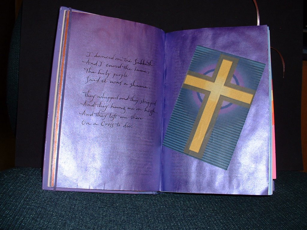
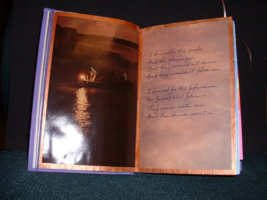
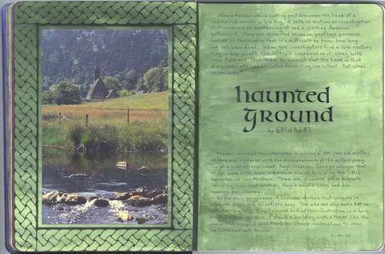
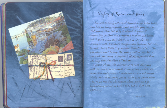
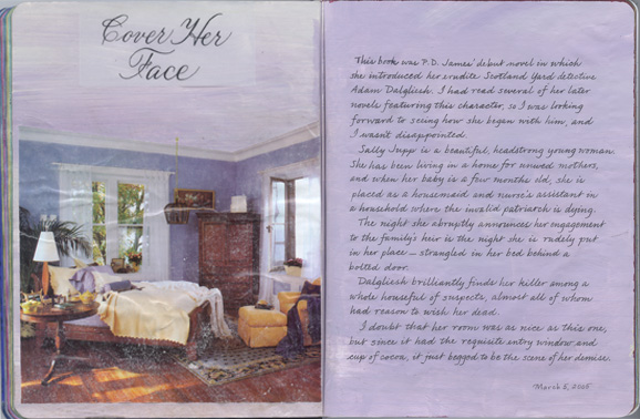
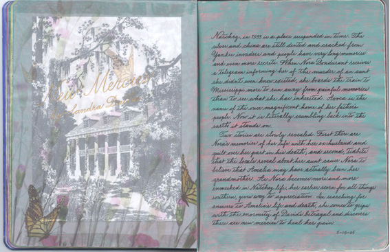
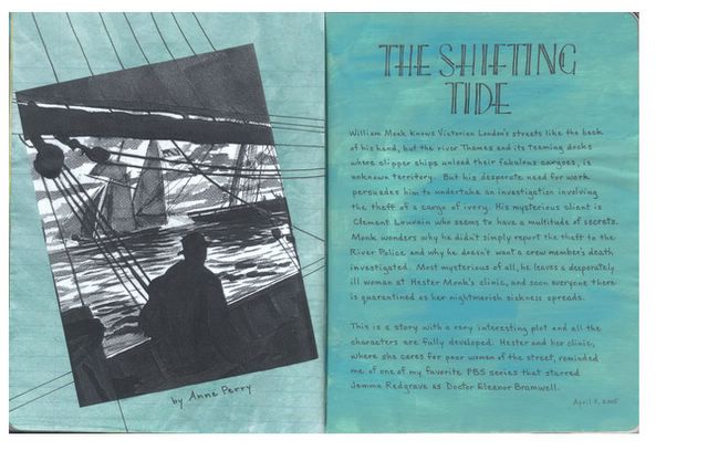
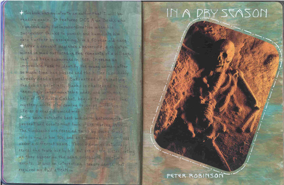
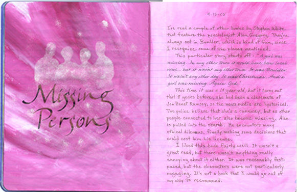
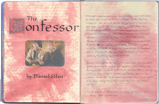
This is the cover of a book that I made in a class this past weekend. Sharon Zeugin was the instructor, and she showed us this technique which she learned from Thomas Ingmire, who had learned it from a Japanese man.
Here's how:
1. Fold 3 signatures in half. I used 3 sheets of Arches Text Wove per signature, each 10"x13".
2. Take 2 cover sheets that are the same size as your unfolded pages. Fold each of these about 1" from one of the shorter sides. I used pieces of paste paper from Arches Text Wove that I had made in a class taught by Rosie Kelly.
3. Place the last signature inside the fold of the back cover. Lay the middle signature on top of the cover's flap. Place the first signature inside the fold of the front cover, and lay the flap side down on top of the middle signature.
4. Jog the spine to align all the signatures and clip everything together.
5. Come down about 1" from the top and lay two fingers across the spine. Mark with a pencil on either side of your fingers. Repeat at the bottom of the spine.
6. Use an X-acto knife to score the pencil marks across all layers.
7. Remove the clips and slice individual sections at score marks about 1/8" deep with the knife. Check to be sure it cuts through to the center page. Take care to keep the signatures in order.
8. Measure 2 pieces of waxed linen thread, each 2 1/2 times the length of the spine. (Heavily-waxed thread will help hold the needles in place when they're dangling as you work.)
9. Place a tapestry needle on each end of each thread, for a total of 4 needles.
10. Push needles from one thread through the 2 holes at the top of the first signature, coming from inside the fold. Repeat at the bottom holes with the other thread & needles. Try to keep the ends of the threads equidistant.
11. Attach the middle signature by sewing from outside of fold to inside. Then cross each pair of needles over and out their partner's hole to come back to the outside. Be sure your stitches are taut.
12. Attach the last signature & back cover by pushing needles from the outside to the inside. Tie the top 2 threads together with a square knot (rt. over lt & lt. over rt.), placing the knot over the hole that is nearer to the middle. Repeat with the bottom threads. Pull the threads perpendicular to the spine as you tighten them.
13. Take the bottom needles and lace under the top stitch, bringing each one underneath from opposite directions. Tighten and tie off in a square knot. Trim ends about 1/4" from knot. Repeat with other needles.
14. Score the cover extensions about 1/8" beyond the pages and fold toward the spine. You can glue the cover extensions at the top and bottom edges to form pockets, or leave them free to serve as book markers. By scoring the back one a bit further away, you can wrap it around and over the front cover, where it can be secured with a ribbon, a paper belt, a button/string closure, etc.

This makes a very sturdy book, and is fast and easy to do. You can add more signatures, attaching them as in Step 11. Try using 2 different colors of thread. Make different sizes. Vary the color of your pages. Mix the types of paper (try adding some mulberry or lace paper.) Attach ephemera to the inside flaps with glue, brads, grommets, or thread (a good place to dangle some beads!)

Thursday, August 18, 2005

Consider the Lilies


This spread was done in a friend's art journal. The pages were handmade paper so they were a bit of a challenge to write on with a pointed nib. The illustrative element was part of a paper napkin that was adhered over a layer of wet matte medium. Can be tricky. Here's how:
1. Decide what part of napkin you want to use. If you want clean lines, cut the shape before separating the layers. If you want a torn effect, that will be more easily done by working with just the top ply from the beginning.
2. Carefully separate the layers of the napkin.
3. Place the napkin where you want it on the spread.
4. Holding it in position, lift one edge and paint matte medium on the page with a wide flat brush. Try not to get any on the napkin itself as it will immediately curl and be very hard to control.
5. Carefully roll the napkin back into place and gently pat it down with the brush. Be very careful as the napkin is easily torn while damp. You will probably get some wrinkles. Don't fret. These just add to the charm!
6. If working with a large piece, you should apply only a small area of medium, press down one part of design, then apply a little more medium, etc.
7. If the design is to go across the gutter, use something stiff and very thin (less than 1mm thick) to press it down between the pages. Be gentle. Get it in securely but don't press too hard as you could damage the binding, as well as tear the napkin.
8. With the stiff strip holding the napkin in the gutter, carefully lift one side of the napkin and with the brush begin applying medium from the gutter out toward the edge of the page. Work quickly as the medium dries fast.
9. Repeat the process for the opposite page, although you won't need the stiffener anymore.
10. After a few minutes when it feels dry, you can remove the wax paper that was protecting the rest of the pages in the book. If you brushed the matte medium all the way to the edge of the book pages, there may be dried fragments that you will need to trim off with sharp scissors.
11. Leave the book open to dry, ideally overnight. It will feel dry in just a few minutes, but if you must close it before the next day, be sure to insert a clean piece of wax paper between the napkined pages.

Tuesday, July 05, 2005

Reading Journal Entry: Ya-Yas in Bloom

This book bounces back and forth between the 1930s (when Teensie, Vivi, Caro and Necie first met as 4-year-olds and the Ya-Yas were born) to the 1960s when they were young mothers dealing with their numerous offspring, to the present day when they rally in their intrepid manner to foil the kidnapping of a grandchild. These sassy Louisiana belles are charming, outrageous and full of life--as much a hoot as they were in Rebecca Wells two previous offerings.

For the illustration background, I found this beautiful picture of irises and other flowers in a gardening magazine. The adorable little girls were located in various clothing ads. For the two at the top of the page, I partially cut around some of the flowers and tucked the girls behind before gluing the page down. The background of the left page was done by brushing on several shades of purple acrylics and leaving unpainted white areas. The text was done with a white GellyRoll pen.

Wednesday, June 22, 2005

Reading Journal Entry: Shroud for a Nightingale


The young women of Nightingale House are there to learn to nurse and comfort the suffering. But when one of the students takes her turn as the patient in a demonstration of nursing skills, she is horribly killed when a cleaning fluid is poured down the tube inserted in her throat. Soon another student dies and Adam Dalgliesh has his work cut out for him.

P.D. James is so quotable. Here's a good one from this book: "If you are proposing to commit a sin it is as well to commit it with intelligence. Otherwise you are insulting God as well as defying him."

This book was full of words I needed to look up:
tessellated (hall) (floor) - checkered or mottled
minatory (voice) - threatening or menacing
theurgy - miracle worker
invidious - envious or injurious
lugubrious - mournful
etiolated (neck) - lacking in strength; pale
pavane (verbal) - stately court dance
plaice - large European flounder

I found this picture of a nurse in a magazine ad. I think the bottle she is holding is STP and she is "doctoring" a car. I wanted to tone down the glossiness and make it look like she was from the 1950s, so after painting over the label on the bottle and setting her against a somber backdrop, I covered her with beige tissue paper and matte medium. I used Schmincke "Madder Red" gouache for the title, using my poor rendition of Mike Kecseg's pointed pen Blackletter alphabet.

Reading Journal Entry: Prince Edward


This book is the reminiscence of the now adult Ben Rome who is recalling the events of the summer of 1959 in Prince Edward county, Virginia. The segregationist whites in power were scrambling to set up a system of private education in response to the Brown v. Board of Education decision. As a 10-year-old, he is bewildered by these machinations, but also fascinated by the conflicting emotions that are evident in the adults around him. His sister Lainie is depressed about giving up college for marriage and an unwanted pregnancy. His parents are constantly at odds, and his twenty-something brother seems to be headed for serious trouble. As Ben and his black playmate gather eggs each day on his father's chicken farm, he worries about what will happen to Burghardt when the "separate but equal" schools are closed. In trying to understand what is going on, Ben eavesdrops and snoops, and learns more than he bargained for. Hovering over everyone like a malevolent spider is his powerful grandfather who takes perverse pleasure in humiliating Ben and anyone who can't stand up to him. This escalates beyond mere "teasing," and when it does, there is a violent consequence.

I was just about a year younger than Lainie in 1959, and I vaguely recall my classmates disputing the "rightness" of integration, but it was a few more years before it came to Nacogdoches. When it did, I had already moved away, and the whites must have become resigned to it by then, because I don't recall hearing about any violence--which is surprising considering how racist we all were back then.

My muse came through for me again. I had painted the pages of this spread with Americana brand "Graphite" acrylic to try and match the background of the eggs photo. I wrote the text with a white Gelly Roll pen since I knew it would show up well on the dark paint, although I used a white Prismacolor pencil for the title and author. Only after the fact, did I realize how perfectly it went with the theme of the book...looks just like writing on a blackboard.

Tuesday, June 21, 2005

Reading Journal Entry: The Good Neighbor


Although this author has a beautiful way with words, I did not find the plot itself particularly compelling, but it was just a necessary vehicle for the characters anyway. Every one of them was a bit strange in a Garp-like way. The Baltimore Sun recommended it "for readers who enjoy the eccentric and rambling family narratives of John Irving." That was in a review of Eddie's Bastard which I haven't read, but it certainly applies to this book, too.

A young NYC couple happen upon a 150 year-old house in Pennsylvania and buy it for two very different reasons. Colt wants it as a status symbol of his huge success in the stock market, while Francie sees it as a way to gain the peace and solitude she feels she needs as a blocked poet. Scattered throughout the narrative are glimpses of the Musgrove family that built the house and lived in it for several generations. When Francie discovers an old cemetery and a hidden journal, she is entranced by the previous inhabitants, but Colt is repelled by the idea of dead people on his property and has the bodies exhumed. This leads to some unexpected consequences from their neighbor and to a marital showdown as well.

I wrote the review on a piece of vellum. It was printed with rosebuds that you can barely see. I used a green Copic Multi-Liner pen 0.1, which worked just great on the vellum. I had previously painted the background green, so when I decided to use these pages for this spread, I added darker green strokes to simulate grass. I found the tombstones on the cover of a book about doing genealogical research. After cutting around them, I adhered them at the bottom with double-stick tape, but used some foam tape at the top to make them stand away from the page just a bit.

"Islands" by Anne Rivers Siddons Posted by Hello

Reading Journal Entry: Islands


When Anny Butler marries Dr. Lewis Aiken, she becomes a member of the "Scrubs", a longtime group of Charleston friends who all have medical connections. For years, they share their free time together at a communal beach house. Then misfortune begins to plague the group, resulting in three deaths. When the story gets top-heavy with disaster, into it roars an unlikely but intriguing new character. Gaynelle Toomer, a Harley-riding, freckle-faced ex-librarian, is hired to do odd jobs for the Scrubs. She becomes a constant companion to Anny's frail friend, Camilla. Camilla, the stabilizing force of this group, turns out to be not at all what she appears, making the story's end a shocker.

Since much of the story centered on a big old beach house, it was natural to feature it as the illustrative element of this spread. I thought the warm colors that I chose for the background contrasted nicely with the dark blue of the sky, so I decided to use blue gouache to write the headings. I had seen the technique of extending an existing picture by continuing the scene past the actual boundaries, so I decided to give it a try here. Since my drawing skills are limited, this looked like something I could handle...just the sky, a road, and some grass. It's not very well done, but it was interesting to try.

Reading Journal Entry: Hard Revolution


This story is set in Washington, D.C., mostly just before and during the 1968 riots sparked by the killing of Martin Luther King, Jr. The first few chapters take place in 1959, introducing characters whose paths will entwine later. There's Derek Strange, a young black boy caught shop-lifting, but given a break that sets his life on a law-abiding path; his older brother Dennis; and their hardworking parents. By 1968, Derek is a young cop and Dennis is a pot-smoking slacker. The narrative unfolds two scenarios: a plan by Dennis and two street thugs to rob a store, and a plot by three white hoodlums to rob a bank--but only after they drunkenly kill a young black man for sport. The action is fueled by race relations and is a study of a society tearing itself apart as tensions escalate. This tale is a prequel to several other novels that feature middle-aged P.I. Derek Strange. The author, George Pelecanos, will be added to my "Want to Read" list.

"Haunted Ground" by Erin Hart Posted by Hello

Reading Journal Entry: Haunted Ground

When a farmer who is cutting peat discovers the head of a red-haired woman in his bog, it sets in motion an investigation that involves an archaeologist and a visiting American pathologist. They are consulted because peat bogs preserve bodies so thoroughly that it's difficult to know how long one has been dead. When the investigators find a 16th-century ring in her mouth, the initials engraved on it, along with local folklore, lead them to suspect that the head is that of a woman who was executed for killing her infant. But where is her body? The police aren't too interested in solving a 500-year-old mystery, as they are occupied with the disappearance of the wife and young son of a local entrepreneur, Hugh Osborne. Gossips whisper that he did away with them, and accuse him of fathering the little daughter of Una McGann. There are, of course, other suspects including Una's dour brother, Hugh's cousin Lucy, and her teenage son Jeremy. As the story progresses, it becomes obvious that someone is trying to scare the scientists away. The who and why make for an entertaining tale.

I was pleased to find this illustration in a book about Ireland, because it shows a building with a tower like the one in the story. I spent hours working on this spread, even after using Mark Van Stone's "easy" instructions for drawing the Celtic knotwork border. Actually, he does simplify the process, but I'm so spatially challenged that it took me forever, and is far from perfect. But I like it anyway. I'm also happy with the way the lighter greens in the background that I painted before doing the knotwork, give it a dappled look, as though sunlight is reflecting on it. This is something that I could have never planned for. This is why I love slopping acrylic paints down on a page. Sometimes I get such a wonderful surprise like this after completing a spread. I truly, truly believe in my artistic muse. She only came into my life 3 years ago when I learned to just let go and trust the process. For too many years I had been a perfectionist, and wouldn't even try something until I had planned out the whole thing. I was transformed while taking Judy Melvin's class that she calls "Don't Think, Just Get It Down." And I will be privileged to take it again in September when she comes to Houston.

"Nights of Rain and Stars" by Maeve Binchy Posted by Hello

Reading Journal Entry: Nights of Rain and Stars

This was not one of Maeve Binchy's better books. She had too many characters and subplots going on, so that none of them felt fully developed. I guess all best-selling authors are pressured to churn out books, but it shows when their hearts aren't in it. I've seen it happen with Elizabeth George, John Grisham, Larry McMurtry, Michael Crichton, etc. The publishers want to keep the money rolling in, but a bad book can cause a backlash of disappointed fans who may transfer their affections. It took me years to return to Patricia Cornwell after I read her awful "Blowfly".

In this book, a group of tourists interact with each other and with the locals in a small Greek village, while we learn bits and pieces of their lives--but not enough of the details to really cause us to care about them. They're all troubled characters whose problems get miraculously solved by book's end, but I felt like yawning. I have loved most of Binchy's books, so this one was a real disappointment for me.

I had pre-painted these two pages with nothing in mind at the time. I used several different shades of blue, just randomly brushing them on. I certainly wasn't consciously trying to create the look of water, but I guess my muse was. When I had first brushed on the dark paint, it rippled the page near the gutter, so when I brushed on the lighter color it only hit the tops of the ripples. But now the page is perfectly flat after being pressed under a weight.

The picture is from a travel book about Greece, and the postcards are a rubberstamp from Aspects of Design. I stamped it twice on manilla CS, and cut them apart, then reassembled for a dimensional look. I glued a real fiber right on top of the stamped string. The title is my attempt at a modified Italic after a class taken with Sharon Zeugin.

Monday, June 20, 2005


"Slaves of Obsession" by Ann Perry Posted by Hello

Reading Journal Entry: Slaves of Obsession

It's the summer of 1861 and William and Hester Monk find themselves in the midst of the Battle of Bull Run when they travel to  America to bring back a 16-year-old girl who has run off with a Union gun buyer who is the prime suspect in the murder of the girl's father. This book had a good surprise ending. I had kind of suspected the guilty party, but not to the extent of his wickedness. I had thought he was driven to desperation by blackmailers, but not that he was the actual murderer.

Because this novel takes place partly in America during the Civil War, I decided to write the review in Spencerian Script which was a business style handwriting developed in the United States that was widespread in 19th century America. It is similar to Copperplate, but has simpler lowercase letters but very ornate capitals. It was the script used by Abraham Lincoln. By that time period, steel nibs had been invented, and by applying and releasing pressure the writer would alternately create thick and thin strokes.

Since my background color was quite dark, I wrote with white gouache. The inkwell and nib were cut from a wonderful piece of paper printed with all kinds of old-time writing tools. I found the photograph in a children's book about the Civil War, and it shows a number of injured men like the ones tended by Hester Monk. I put stickers on the 4 corners to resemble those often used in old photograph albums.

"The Intelligencer" by Leslie Silbert Posted by Hello

Reading Journal Entry: The Intelligencer

In 1593, London's most popular poet and playwright was stabbed to death. The royal coroner ruled that Christopher Marlowe was killed in self-defense, but historians have long suspected otherwise, given his role as an "intelligencer" in the Queen's secret service.

This novel has interlocking narratives. The one that takes place in the present, features Kate Morgan, a Renaissance scholar, who works for a private investigative firm that doubles as an off-the-books U.S. intelligence unit. As she is trying to discover why someone is willing to kill for a 16th-century manuscript that is written in code, we are taken back to 1593 where we learn that the pages were intelligence reports compiled by Thomas Phelippes, a spymaster for Elizabeth I. The chapters alternate between the two time periods and the mysteries intersect and unfold together. The author is herself a Harvard graduate, Renaissance literature scholar, and private investigator. This was a fascinating blend of Elizabethan espionage and modern intrigue. And the author had two surprises at the end--one from each setting. I love it when a writer makes me drop my jaw!

The idea for the eye peeking through came from the cover. I went to the author's website and found the page of Elizabethan code. I was able to get a very controlled burn to "age" the edges and create the hole by using an incense stick. The first time I tried this, I just used a match, and even though I had made a damp line beyond where I wanted the burn to stop, it burned more than I intended. The incense stick worked great, although it took time and patience.

I first painted the left page with Apple Barrel "Sandstone" paint. After it was very dry, I laid down masking tape about 3/4" from the edge and painted the border and the entire right page with Delta Ceramcoat "Black Cherry." I had not burnished the edges of the tape because I wanted the paint to creep under just a bit and give a ragged look. After writing the review, I painted my hand with the red paint to make a "bloody" handprint, and flicked on a few drops of "blood." I love this spread, although one of my friends upon seeing it said, "You're weird!"

"Cover Her Face" by P.D. James Posted by Hello

Reading Journal Entry: Cover Her Face

This book was P.D. James' debut novel in which she introduced her erudite Scotland Yard detective Adam Dalgliesh. I had read several of her later novels featuring this character, so I was looking forward to seeing how she began with him, and I wasn't disappointed.

Sally Jupp is a beautiful, headstrong young woman. She has been living in a home for unwed mothers, and when her baby is a few months old, she is placed as a housemaid and nurse's assistant in a household where the invalid patriarch is dying. The night she abruptly announces her engagement to the family's heir is the night she is rudely put in her place--strangled in her bed behind a bolted door. Dalgliesh brilliantly finds her killer among a whole houseful of suspects, almost all of whom had reason to wish her dead.

The picture was an advertisement in an interior design magazine, and I doubt that her room was as nice as this one, but since it had the requisite entry window and cup of cocoa, it just begged to be the scene of her demise. I scuffed it a bit with very fine sandpaper to age it. The title is written on a small piece of Canson Vidalon vellum. I used Scotch Vellum tape to attach it, and it really doesn't show through. The picture was cut at the edge of the crown molding, so the ceiling is actually the acrylic painted page. It is difficult to see, but if you click on it for an enlarged view, you will be able to just make out that I went over the chain of the birdcage with a gold gel pen, extending it to a hook in the "ceiling."

"11th Month, 11th Day, 11th Hour" by Joseph Persico Posted by Hello

Reading Journal Entry: 11th Month, 11th Day, ...

Largely through the voices of soldiers in the trenches, the author describes how both sides of the conflict sent men to die senseless deaths on November 11, 1918 right up until the final minute before the Armistice--a staggering 11,000 casualties. In this audio version, Harry Chase read all of the soldiers words in their respective accents--German, British, French, and others, and was very convincing with all of them.

Once the arrangements were made for the truce to begin at the resonant 11th hour of the 11th day of the 11th month, the armies of both sides were ordered to fight on; the idea apparently being to secure as much ground as possible before peace broke out. As a result, more died on November 11, 1918 than on D-Day a quarter-century later! This book was very revealing in the senseless stupidity of WWI in the first place, and breath-taking in the utter lack of disregard in ordering men to their deaths while peace was already agreed to. But for me, it went on too long, and I found it very disconcerting how the author constantly skipped back and forth in time.

I used khaki colored paint for the background. The numbers that make up the title were stamped with a numeral from a really old set of rubber stamps that I found in an antique store in Nacogdoches a few years ago. They are housed in a wooden box that's about 10" x 21" x 1.5" deep and appear to have been used by a teacher. The wood mounts have grooves cut that allow you to line them up on strips to spell out words in a straight line. It tickles my fancy to think that perhaps these might be from the WWI era. I used Nick Bantock's "Sapmoss Green" ink. I like how it dried with a textured look.

I found the newspaper page in a book that contained significant front pages of the New York Times, and the photo was from another book about WWI. I used some photo corners on it to make it look as though it might have come from someone's album.

"New Mercies" by Sandra Dallas Posted by Hello

Reading Journal Entry: New Mercies

Natchez, in 1933 is a place suspended in time. The silver and china are still dented and cracked from Yankee invaders and people have very long memories and even more secrets. When Nora Bondurant receives a telegram informing her of the murder of an aunt she didn't even know existed, she boards the train to Mississippi more to run away from painful memories than to see what she has inherited. Avoca is the name of the once magnificent home of her father's people. Now it is literally crumbling bck into the earth it stands on.

Two stories are slowly revealed. First there are Nora's memories of her life with her ex-husband and guilt over her part in his death; and second, tidbits that the locals reveal about her aunt cause Nora to believe that Amalia may have actually been her grandmother. As Nora becomes more and more enmeshed in Natchez life, her earlier scorn for all things southern, gives way to appreciation. In searching for answers to Amalia's life and death, she comes to grips with the enormity of David's betrayal and discovers there are new mercies to heal her pain.

The background for these pages was made by first brushing them with a quinacridone magenta glaze. When that was dry, I brushed on Anita's acrylic paint in "Running River" green. Before it was completely dry, a damp piece of boat sponge was pulled across to lift off parts of the paint, letting the magenta glaze show through.

The left page features a photocopy of a Natchez antebellum home, covered with a piece of printed vellum (that's the flowers and butterflies.) I used a pointed nib and Dr. Martin's Iridescent Calligraphy Color in "Copperplate Gold" to write the title and author.

"The Shifting Tide" by Anne Perry Posted by Hello

Reading Journal Entry: The Shifting Tide

William Monk knows Victorian London's streets like the back of his hand, but the river Thames and its teeming docks where clipper ships unload their fabulous cargoes, is unknown territory. But his desperate need for work persuades him to undertake an investigation involving the theft of a cargo of ivory. His mysterious client is Clement Louvain who seems to have a multitude of secrets. Monk wonders why he didn't simply report the theft to the River Police and why he doesn't want a crew member's death investigated. Most mysterious of all, he leaves a desperately ill woman at Hester Monk's clinic, and soon everyone there is quarantined as her nightmarish sickness spreads.

This is a story with a very interesting plot and all the characters are fully developed. Hester and her clinic, where she cares for poor women of the street, reminded me of one of my favorite PBS series that starred Jemma Redgrave as Doctor Eleanor Bramwell.

I've read several books by Anne Perry recently, and this is my favorite in the Monk series. I am quite pleased with the illustration that I found to accompany the review. I think it is evocative of the sinister mood of this story. I found it in a book about clipper ships. Using a black Pitt pen, I extended the lines of the sails and ropes to lead the viewer's eye completely off the page. Angling the picture seemed to be in keeping with how off-balance the main characters felt as they were manipulated by the antagonist. I tried to emulate an alphabet from an exemplar that I got from Alan Blackman many years ago. I believe it can be found in the book "Sixty Alphabets" published by Thames and Hudson. I wrote it with black gouache, using a #4 Mitchell nib.

"My Jim" by Nancy Rawles Posted by Hello

Reading Journal Entry: My Jim

Told entirely in dialect, this first-person narrative features Sadie, a slave emancipated during the Civil War. While making a quilt with her granddaughter who was born free and is trying to decide whether to marry and move west, Sadie is inspired to tell the story of her own separation and loss. In particular, Sadie recalls her husband Jim, and their two children. Jim was sold away and later escaped to freedom with none other than Huckleberry Finn (a detail that is not further developed.) As Sadie tells her story, three objects play recurring roles-- an African bowl that came from her own grandmother, a small knife inherited from her mother, and a hat that had belonged to Jim.

I had a lot of fun making the illustration for this book. After glazing the pages with a mixture of Golden's Yellow Oxide fluid acrylic and Soft Gel Matte Medium, I added a touch of soft red by pulling a sponge across the pages in a few places. I wrote the title with a #1 Mitchell nib and walnut ink. It doesn't show up very well in the scan, but I drew in some tiny lines on the letters with a dark brown Pitt artist pen (size S) to simulate the look of ones carved into wood. Since a small knife plays a recurring role in the story, this seemed apropos.

The main characters kept their hands busy making a quilt while the story progressed. This gave me the inspiration for making a paper quilt on the right-hand page. I actually used my sewing machine to stitch around the woman's picture, although the other "stitches" are drawn with a micro pen. The triangles were cut from bits of scrapbooking paper and attached to a piece of sticker paper. I even mitered the corners of the quilt's border for a more authentic look.

Sunday, June 19, 2005


"In A Dry Season" by Peter Robinson Posted by Hello

Reading Journal Entry: In A Dry Season

This was the first book I had ever read by Peter Robinson. I love a good mystery, and I particularly have a thing for those that are set in England, so I was delighted to discover this author who will take his place alongside P.D. James, Elizabeth George, Ruth Rendell, Deborah Crombie, John Harvey and Stephen Booth (to name a few of my favorites.)

It features DCI Alan Banks who is on desk duty for insubordination when his supervisor thinks to punish and humiliate him even further by assigning him a 50 year old cold case. After a drought depletes a reservoir, a skeleton mired in mud surfaces in the remnants of a village that had been submerged in 1953. It seems an impossible task to identify the young woman after so much time has passed and the killer is probably already dead as well. But instead of resenting the job as pointless, Banks is challenged by the seemingly insurmountable odds, and with the help of DS Annie Cabbot, begins to unravel the mystery while also coming to grips with his life as a newly divorced man.

The book ratchets back and forth between the present and events that took place during WWII. The flashbacks are revealed to us by young Gwen, who is now in her 70s, and as a famous author lives under a different name. These memories enticingly reveal the truth bit by bit, but are a little disconcerting as they appear on the same pages with real-time events. It was an interesting literary device that required my full attention.

The background for these pages was Anita's brand acrylic paint in "Turquoise" and "Moccasin Brown". The white writing was done with a Gelly Roll pen in the Art Nouveau alphabet. I put lines and dots around the illustration to set it off.

Thursday, April 28, 2005

Reading Journal Entry: The Lost Mother


I thoroughly enjoyed this book. It is set in Vermont during the Depression as it is experienced by 12-year-old Thomas and his spunky little sister Margaret. The opening line says, "They said it was bad for everyone, but nobody else the boy knew had to live in the woods." As the story begins, it is summer, so it does not seem so terribly bad to have to live in a tent. The worst thing is missing their beautiful mother who just up and left one day, supposedly to work in a factory. The children are certain that she will come home just as soon as she has saved enough money. Their father is an itinerant butcher who struggles to provide for them, and often must leave them alone as he scours the countryside looking for work. He is devastated by his wife's desertion, but the children misunderstand his anger and bitterness. A prosperous neighbor woman begins to woo the children to be companions for her pitiable, but warped, son--and soon events spiral out of control. One reviewer compared this author to John Steinbeck and Carson McCullers, and I would have to agree that her story has elements of both, and is "a gritty, beautifully crafted novel rich in wisdom and suspense."

For the illustration of this book review, I decided to use a photo of my mother who was a child during the Depression. It was serendipitous that the only photo I have of her during that era shows her holding a cat, since one poignant episode in the book is what happens to Margaret's cat and Thomas's part in that. A significant, recurring theme in this story is Thomas's ambivalent feelings toward Margaret. It is obvious that he loves her and feels responsible for her well-being, but she also aggravates and exasperates him. Sometimes this leads him to do mean things to her, which he regrets even as a 70-year-old.

I wrote the title in casual Roman caps that I learned from Sherri Kiesel. These were done with a black .8 Copic Multiliner pen, with the horizontal lines drawn by a Scarlet Red Prismacolor pencil. The background is acrylic paint in three shades of green (Celedon, Sage, English Ivy) with touches of Sandstone. The text was written with a .05 Copic pen.

Tuesday, April 26, 2005


"Missing Persons" by Stephen White Posted by Hello

Reading Journal Entry: "Missing Persons"


I've read a couple of other books by Stephen White that feature the psychologist Alan Gregory. They're always set in Boulder, which is kind of fun, since I recognize some of the places mentioned. This particular story starts off:
"A girl was missing. In any other town it would have been local news...but it wasn't any other town. It was Boulder. It wasn't any other day. It was Christmas. And a girl was missing. Again. God."
This time it was a 14-year-old, but it turns out that 8 years before, she had been a classmate of Jon Benet Ramsey, so the news media are hysterical. The police believe that she's a runaway, but as other people connected to her also become missing, Alan is pulled into the search. He encounters many ethical dilemmas, finally making some decisions that could cost him his license.

I like this book fairly well. It wasn't a great read, but there wasn't anything really annoying about it either. It was reasonably fast-paced, but the characters were not particularly engaging. It's not a book that I would go out of my way to recommend.

It doesn't show particularly well in the scan, but the silhouettes of the people are speckled with white in imitation of snow. This was acrylic paint applied with a sponge over a stencil cut from an actual photograph of four people. I didn't want their features to show, as a way to indicate the theme of people who are missing. I am not at all happy with the way I wrote the title. I used walnut ink, and seemed to have no control over how it came out of the pen. Note to self: Gouache works so much better on these acrylic-painted pages.

"A Christmas Visitor" by Anne Perry Posted by Hello

Reading Journal Entry: "A Christmas Visitor"

This novella features one of the characters of the William Monk series. Henry Rathbone is a distinguished mathematician and the father of Sir Oliver Rathbone (a one-time suitor of Hester Monk.) He is summoned to the Lake District by his goddaughter Antonia Dreghorne, whose husband has recently died in what appeared to be a senseless accident. But his good name is being smeared by a man he sent to prison for 11 years, and now Judge Dreghorne's wife and brothers fear he was murdered by Ashton Gower. This was a pleasant little read, but far from gripping. A bit of trivia that tickled me were the whimsical names of the jams that Henry had for breakfast: witherslacks (damson plum), black kite (blackberry) and hinberry (raspberry)

I made the illustration for this book review by first painting the pages with purple acrylic paints. The estate that is at the heart of the story was represented by tearing around a picture of a home that I found in a British tourism magazine. To soften the torn edges and blend them into the background, I used rubberstamping pigment inks on a fingertip dauber. The title was written with gold gouache, while the author's name was gold gouache with a bit of indigo added to it.

"The Confessor" by Daniel Silva Posted by Hello

Reading Journal entry: "The Confessor"

Many years have passed since Gabriel Allon took retribution on those who killed the Israeli athletes at the Munich Olympics. Now he is a master art restorer in Venice. But when one of his fellow agents in that affair is murdered, Gabriel is reactivated by his old mentor, Ari Shamron, to find out why. He discovers that Benjamin had been investigating Pope Pius XII's role in the Holocaust, and apparently was getting too close to the truth. A secret Vatican society known as the Crux Vera is intent on hiding the facts. A powerful Cardinal and his henchmen plan to assassinate the new Pope to keep him from opening the Vatican's secret archives. Gabriel races across the face of Europe, from Venice's Jewish ghetto to Vienna to London to a convent on Lake Garda, and finally to the innermost parts of the Vatican. He is usually just one step ahead of Italian and German police, an assassin known as The Leopard, and even some Israeli agents, as he desperately tries to discover the facts and save the Pope. In the end, it all comes down to a very young nun and a sleepy little orphan boy.

 I was reading it about the time that Pope John Paul was in his final illness, and one of the characters in the book is the imaginary pope who follows him.

The Rule of Four Posted by Hello