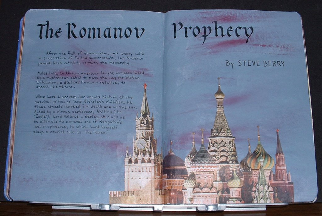
After the fall of communism, and weary with a succession of failed governments, the Russian people have voted to restore the monarchy. Miles Lord, an African-American lawyer, has been hired by a mysterious cabal to pave the way for Stefan Baklanov, a distant Romanov relative, to ascend the throne. When Lord discovers documents hinting at the survival of two of Tsar Nicholas's children, he finds himself marked for death and on the run. Aided by a circus performer, Akilina (the "Eagle"), Lord follows a series of clues as he attempts to unravel one of Rasputin's last prophecies, in which Lord himself plays a crucial role as "the Raven."
The background for this spread was one that I had painted ages ago, and just kept skipping over because it really didn't look right for any of the books that I wanted to review. Actually, I thought it was pretty drab until now. It never ceases to amaze me how just the right picture can improve a background. The onion domes of Red Square were from the travel section of the Sunday paper and I had saved them for years, not knowing what I would do with them. I just knew they were too pretty to throw away. What really made them work on this page was cutting away the background of the photo, so that my painted pages became the sky. It was a little tedious cutting around those tiny crosses but Fiskars micro-tip scissors were a huge help. I used matte medium to adhere the image, brushing it on a bit at the time. I've found that it's a mistake to apply any adhesive all over the back of a cut-out if it's from thin paper. The little parts will curl like mad and drive you insane. I position the image exactly where I want it on the spread, and while holding it in place with my left hand, I use a flat brush to apply the medium in one spot, smooth it down and continue adding medium until the whole thing is stuck in place. The beauty of matte medium is that it doesn't show like regular glue when any oozes out. And it brushes on more easily than glue.
I wrote the title in Gothicized Italic, using Schmincke black gouache and a Mitchell #1 nib. The author was written with a .8 Copic MultiLiner and the summary was done with a Uniball Vision micro pen.
2 comments:
i really like this idea of a reading journal. i wish i'd have time to do so much reading AND decorate a jorunal about it. it would be really fun. great inspiration and art you do
Re your comment of using thin paper cut-outs, I've found if I cover the cutout with clear contact paper, and THEN cut it out I have a more substantial cut-out, and the contact paper seems to enhance the colors. Then I glue as usual.
Post a Comment