Sunday, February 12, 2006

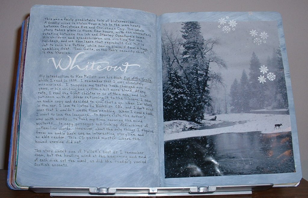
Reading Journal: Whiteout


This was a fairly predictable tale of bioterrorism. A deadly virus is stolen from a lab in the wee hours between Christmas Eve and Christmas Day. The whole story takes place in those few hours, with the characters rotating between the lab and Stanley Oxenford's home. His children and grandchildren are visiting for the holidays, and we soon learn that reprobate son Kit is out to ruin his father, while saving himself from a huge gambling debt. Toni Gallo, as the lab's security chief, is the heroine.

My introduction to Ken Follett was his book "Eye of the Needle", which I read in 1979. I remember that I was absolutely mesmerized. I suppose my tastes have changed over the years, or his writing has gotten a bit more bland. At any rate, I read the first chapter or so of this one, and lost patience with it. After returning it to the library, I saw an audio copy and decided to give that a go. When I'm stuck in the car, I love to listen to books on CDs, and I don't mind ones that I wouldn't waste time reading. When I read a book, I want to love the language...to appreciate the author's way with words...to take my time savoring the mind pictures...to copy passages and look up definitions of unfamiliar words. However, about the only things I require from an audio book are an interesting storyline and an able reader. This CD passed muster where the bound version did not. The story wasn't one of Follett's best as I remember them, but the howling wind at the beginning and end of each disk set the mood, as did the reader's varied Scottish accents.

For the background of these pages I used Apple Barrel's "Blue Stoneware" acrylic paint, overbrushed with Americana "Titanium White." The title was written with a Zig embossing brush, covered with white embossing powder and heated til it melted. To focus the eye and tie the magazine photo to the previous page, I stamped and heat-embossed a few snowflakes.

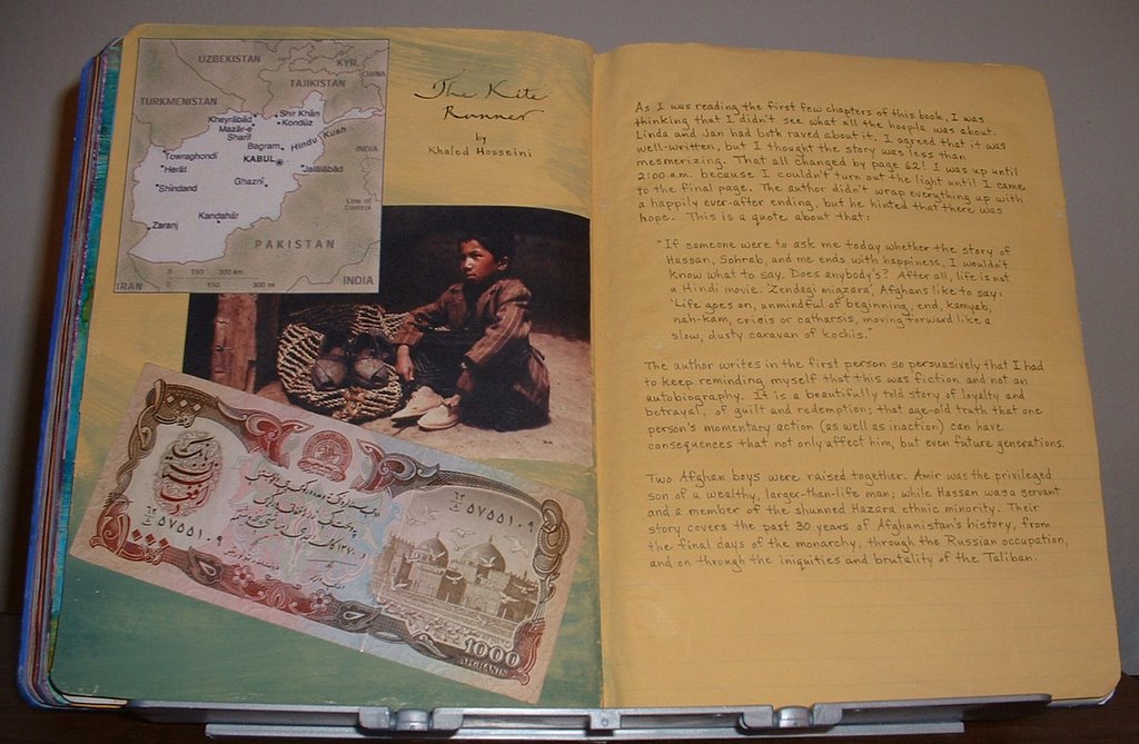
Reading Journal: The Kite Runner


As I was reading the first few chapters of this book, I was thinking that I didn't see what all the hoop-la was about. Linda and Jan had both raved about it. I agreed that it was well-written, but I thought the story was less than mesmerizing. That all changed by page 62! I was up until 2:00 a.m., because I couldn't turn out the light until I came to the final page. The author didn't wrap everything up with a happily ever-after ending, but he hinted that there was hope. This is a quote about that:
"If someone were to ask me today whether the story of Hassan, Sohrab, and me ends with happiness, I wouldn't know what to say. Does anybody's? After all, life is not a Hindi movie. 'Zendagi migzara', Afghans like to say: 'Life goes on, unmindful of beginning, end, kamyab, nah-kam, crisis or catharsis, moving forward like a slow, dusty caravan of kochis."

The author writes in the first person so persuasively that I had to keep reminding myself that this was fiction and not an autobiography. It is a beautifully told story of loyalty and betrayal, of guilt and redemption; that age-old truth that one person's momentary action (as well as inaction) can have consequences that not only affect him, but even future generations.

Two Afghan boys were raised together. Amir was the privileged son of a wealthy, larger-than-life man; while Hassan was a servant and a member of the shunned Hazara ethnic minority. Their story covers the past 30 years of Afghanistan's history, from the final days of the monarchy, through the Russian occupation, and on through the iniquities and brutality of the Taliban.

The illustrations include a map I got off the Internet, a picture of a little Hazara boy from a geography book, and a real piece of Afghan money.

Reading Journal: "Body Double" by Tess Gerrittsen


I always wonder how the author &/or publisher comes up with the title. I do know that often an author isn't allowed to make the final decision. Sometimes titles don't make the least bit of sense. It's as though they're just pulled out of a hat, and have no relation to the story at all. An example of this is "The Rottweiler" by Rendell. Other times, they're vaguely relevant, but in a boring sort of way--such as Dennis McFarland's "Prince Edward."

And sometimes they're inspired, like this one. It was obvious after the first few pages that this title referred to identical twins. But it delighted my word sense later on to realize that the double bodies had a 'double' meaning, and also applied to pregnant women and their babies.

Dr. Maura Isles is a Boston pathologist who is used to seeing dead bodies. But she is shocked to arrive home one evening to find her colleagues at the scene of what they believe is her own murder...for the dead woman is her mirror image. Maura was adopted, and as far as she knew, had no siblings. But DNA tests confirm that this mysterious woman was without doubt her identical twin. Maura's friend, Detective Jane Rizzoli is quite pregnant, but still hard at work and her investigation leads to facts that show the dead woman was a victim of domestic violence. However, things are not quite so easily solved. Soon circumstances cause her to realize that they are on the trail of a serial killer--one who murders pregnant women!

My online friend Linda Cameron gave me the idea of hiding details that give away the plot. I glued a little folder to the bottom right-hand corner and held it closed with a dot of velcro. The reason behind this is so that I can look back to remind myself "who-dun-it" without spoiling the story for anyone looking at my journal.

Tuesday, January 17, 2006

P.5


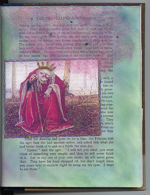
I had the most fun doing this page, although I wish it showed up better in the scan. I found this ogre in a British lit textbook that I had bought for $1 in a library used book sale. He needed a crown to be true to the story, so I made him one, coloring it with a gold StarLightz pen and making "jewels" with other gel pen colors. This gold is the best looking I've found in a gel pen...much shinier than any others I've ever used...and I've tried a bunch! I just glued the picture along the left side, so it can be lifted to read the words underneath. The story says that the ogre was sitting under a canopy made of rose-colored spiderwebs which had tiny green flies embedded in it. To depict this, I pulled apart a used drier sheet that I had dyed with very diluted Golden's Fluid Acrylic in quinacridone magenta. I adhered it along the top of the page with a little thick tacky glue and made the flies with dots of glue covered with green micro-glitter.

P.4


The border for this page was cut from decorative computer paper. The swan was an image I scanned and printed from a Dover book, colored with Prismacolor pencils and added a bit of white micro-glitter on the wings.

P.3


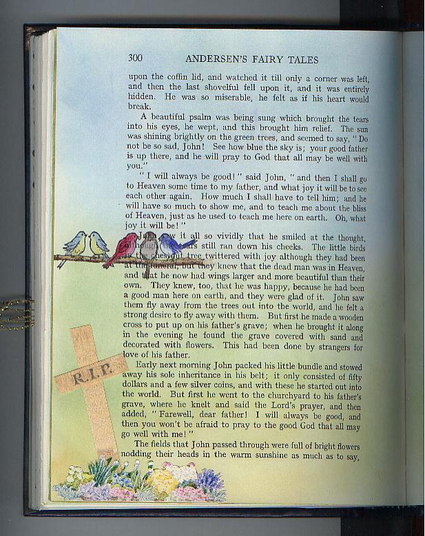
This page told of the burial of the main character's father, so I illustrated that by constructing a cross out of woodgrain paper. The flowers were cut from a gardening magazine and the birds are from a rubberstamp. I used a gray .05 Copic MultiLiner pen to write on the cross. I thought black ink would have been too harsh looking.

Fairy Tale AB - p.2


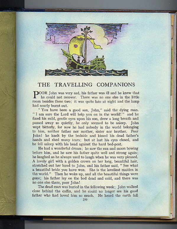
This is the title page of another story in the book, colored just as before.

Altered Book: Andersen Fairy Tales


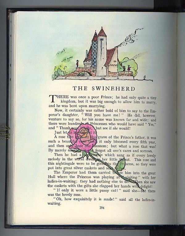
In my Imagine8 art group we have been working on an altered book round robin for the last couple of years. It has taken a long time for the books to make it to everyone because we only meet 4 times a year. These are a few of the pages that I did in Linda's book. I found it to be more of a challenge than I had expected, because I didn't want to cover up the text of the stories. So using acrylic paint as I most often do, was out. Instead, I used sponges to apply rubberstamping inks and found that gave color to the pages without obscuring the words. On this page, I colored the printed illustration at the top with decorator chalks picked up and applied with a Niji waterbrush filled with blending fluid. Then I stamped the rose and colored it the same way, adding a bit of gold Pearl Ex powder for glitz.

Wednesday, December 28, 2005

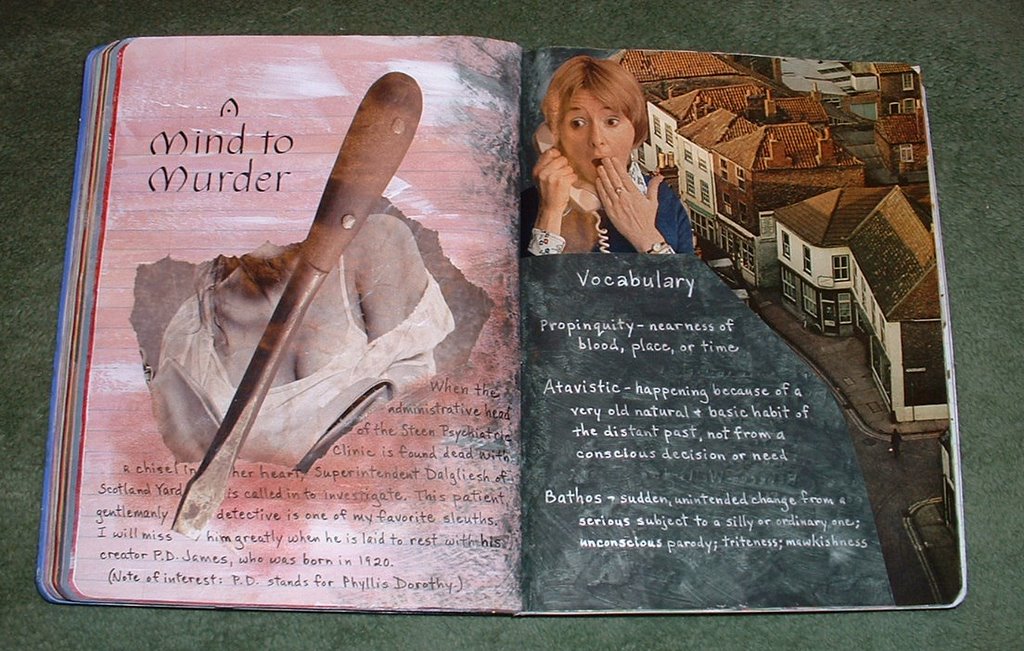
Reading Journal Entry: A Mind to Murder


This is another one of my beloved Adam Dalgliesh mysteries. I'm very fearful that P.D. James may not be writing many more, since she is already 85 years old. Elizabeth George and Deborah Crombie are also authors who have created detectives that seem very human, and I revel in how their sleuths' and extra characters' lives are revealed, bit by bit, as each story unfolds. Unfortunately, I've already read everything they've written, too.

This story takes place in a psychiatric clinic. Dalgliesh is called in when the female administrative head is found with a chisel in her heart. As he questions the staff and patients, he realizes that more than one of them don't mind that she is dead. But of course, he sorts it all out, even turning over what seem like rock-solid alibis.

P.D. James is hailed for writing literary mysteries with intricate plots, complex characters, and an impressive vocabulary. It's no wonder other authors take it as the highest compliment when their work is compared favorably to hers.

Sunday, November 06, 2005

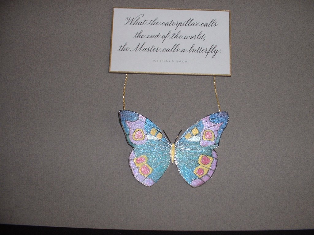
Butterfly Magnet


The theme for our Imagine8 special projects this quarter was butterflies. This is one of my very favorite quotes, so I decided to use it to make refrigerator magnets. I wrote it out in the copperplate hand, then reduced it to 50% and photocopied onto cardstock. Each of these was cut out, edged with a Krylon Gold Leafing pen, and adhered to magnetic business cards.

I stamped the butterflies; colored them with Radiant Pearls; and attached the gold threads with Aleene's Thick Designer Tacky Glue. The antennae are made with black embroidery thread stiffened with Elmer's glue.

Chorus Revisited


This is the final rendition of the chorus. Again, I wrote on scrapbooking paper, but instead of coloring in the versals with Gelly Rolls, I filled them in with a Zig Embossing Brush Pen and sprinkled with purple moire embossing powder.

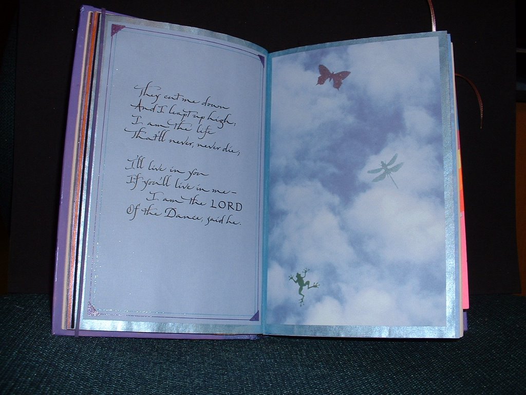
Fifth Verse


Here again, I began by painting the pages with metallic acrylic paint. I needed a lighter blue than came straight out of the bottle, so I mixed it with some silver. The insects were stamped and embossed on the sky paper, and the leaping froggy was a punch-out that I used as a stencil with sponge dauber and pigment ink.

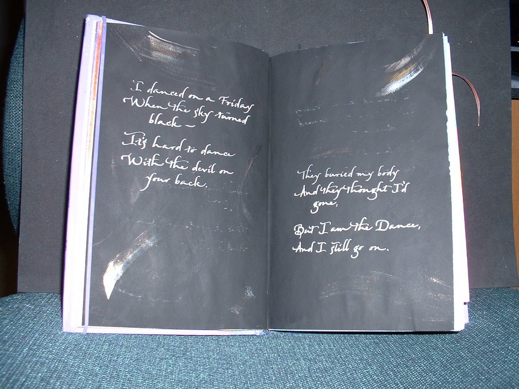
Fourth Verse


I guess it's not very good form to make excuses for one's work, but this really does look better in real life. I almost hate to even show this picture, because it is such a poor rendition of the original. The background here looks like a dull gray, while it is actually the deep, deep black that you can only get from Golden's black gesso. I wrote the verse with white gouache, and added some dry brush swooshes in metallic colors.

Third Verse


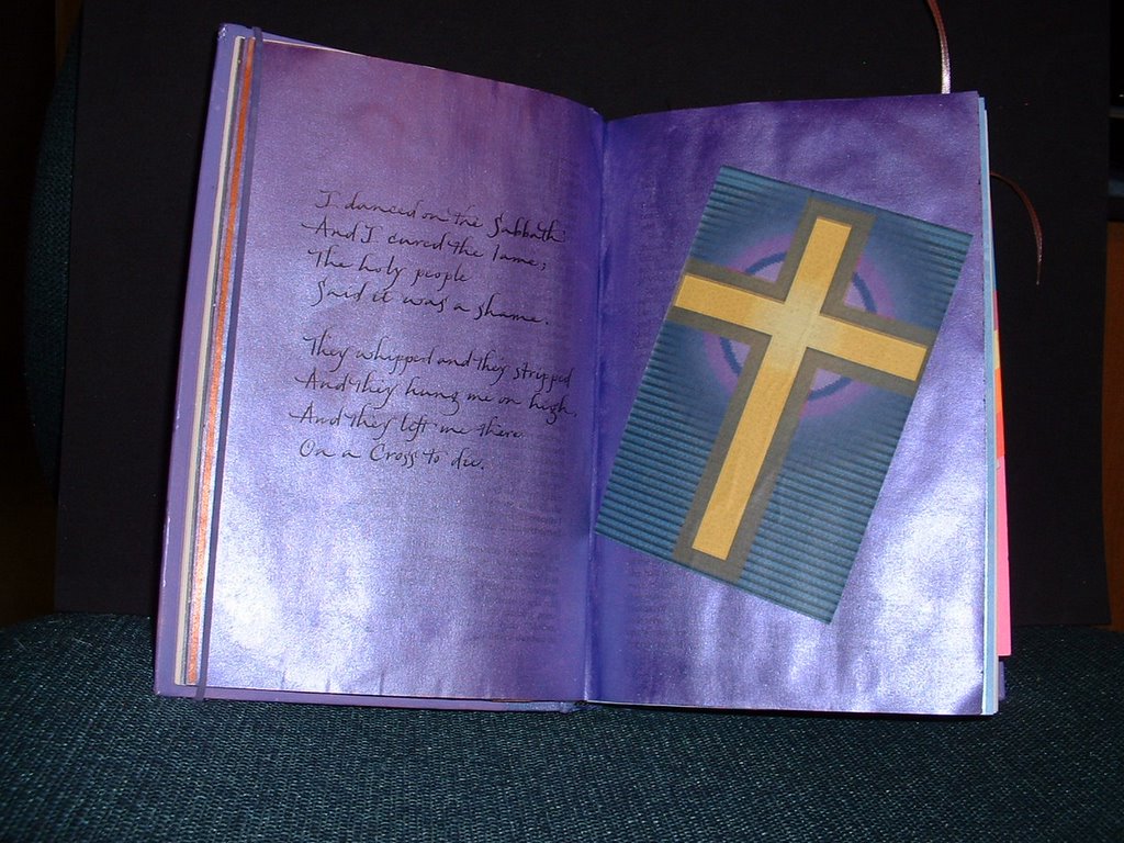
Both pages were painted with metallic purple paint. The cross was a print-out that I chose because it had a nice purple aura in the background and the golden yellow is the beautiful complement of purple.

Second Verse


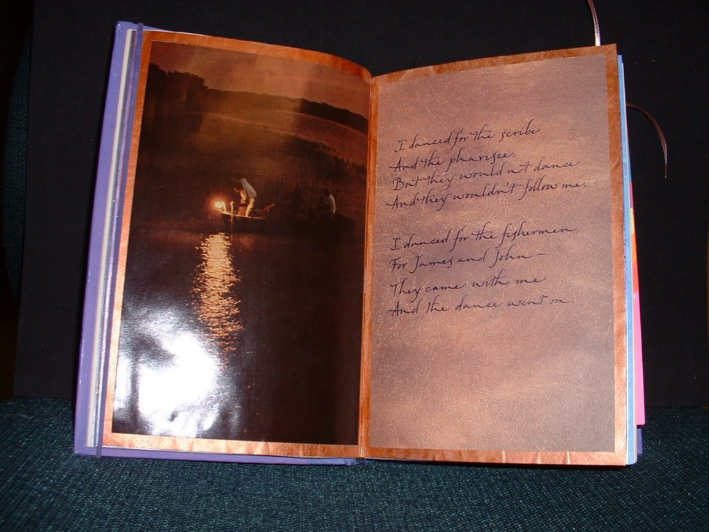
For the second verse of the song, I painted the book's pages with metallic copper paint. The verse was written on a piece of scrapbooking paper that seemed to go well with the photo of the nighttime fishermen.

Chorus


I wrote the chorus on a piece of vellum with Dr. Martin's gold. I hand-stitched it across the top with iridescent thread in purple, aqua, and gold, and then attached it to the page.

1st Verse


This spread is for the first verse of "Lord of the Dance." I wrote it out in an italic variation, using Dr. Martin's Iridescent Copperplate Gold. I just happened to have this piece of scrapbooking paper in my stash, and I was amazed at how well it went with the photograph on the right side.

Lord of the Dance - Title Page


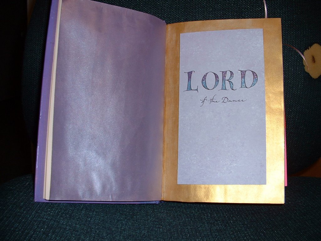
My Imagine8 art group met today. One of our ongoing projects has been an altered book round robin. For this session, I had Peggy's book. Her theme was dance. I decided to do my pages on the verses in the song "Lord of the Dance." This picture shows the title, which I wrote on a piece of lavender scrapbooking paper. The letters in the word "Lord" are versals (which are drawn letters, as opposed to written letters.) They got this name, because they were traditionally enlarged and used to begin verses in illuminated manuscripts. They were usually colored and/or decorated. In this rendition, I used a purple and an aqua Gelly Roll Stardust pen. The book's pages were painted with metallic acrylic paints.

Saturday, November 05, 2005

Reading Journal Entry: The Secret Life of Bees


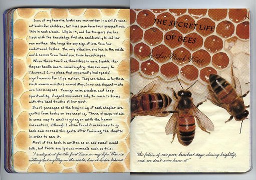
Some of my favorite books are ones written in a child's voice; not books for children, but lives seen from their perspectives. This is such a book. Lily is 14, and for ten years she has lived with the knowledge that she accidentally killed her own mother. She longs for any sign of love from her embittered father. The only affection she has in the whole world comes from Rosaleen, their housekeeper.

When these two find themselves in more trouble than they can handle due to racial bigotry, they run away to Tiburon, S.C.--a place that apparently had special significance for Lily's mother. They are taken in by three black women--sisters named May, June and August--who are beekeepers. Through calm wisdom and deep spirituality, August empowers Lily to come to terms with the hard truths of her past.

Short passages at the beginning of each chapter are quotes from books on beekeeping. These always relate in some way to what is going on with the human characters, although I often found it necessary to go back and reread the quote after finishing the chapter in order to see it.

Most of the book is written as an adolescent would talk, but there are lyrical moments such as this:
"I realized it for the first time in my life: there is nothing but mystery in the world, how it hides behind the fabric of our poor, browbeat days, shining brightly, and we don't even know it."

I had a picture of some bees on a honeycomb that I wanted to use. I planned to partially cut around the bees' bodies, so I painted my pages with FolkArt "Vintage White" to match the wax color. I wrote my review with a Pitt F pen. The title was written with black gouache, using a Tape 1 1/2 mm nib, while the author was written with a Nikko nib. I then sprayed with Krylon Workable Fixatif. I've found that on slick surfaces, it helps to hold the gouache in place. To tie the two pages together, I cut a stencil of honeycomb, and made a border with sponge daubers and Fresco "Golden Parchment" and "Tuscan Earth" inks.

I'm sorry my scanner made a checkerboard pattern on the picture. I've noticed that it tends to do that on browns, especially.

Tuesday, November 01, 2005

Inside 4-Needle Book


This shows an inside page in the book with one of the cover pieces extending to the left.
The calligraphic marks are some examples of form themes, ala Hans Joachim Burgert. I made them using a blue Pitt brush pen.