Tuesday, April 26, 2005

Reading Journal entry: The Rule of Four

One reviewer called this a stunning first novel; a perfect blend of suspense and a sensitive coming-of-age story. If Scott Fitzgerald, Umberto Eco, and Dan Brown teamed up to write a novel, this would be the result.
Two Princeton students are obsessed with unlocking the coded secrets of the "Hypnerotomachia Poliphili", a Renaissance text that has baffled scholars for 500 years. Just as they are on the brink of success, a murder rocks their lives, as well as that of their suite mates.
I found this book totally amazing! It was both erudite and suspenseful, and often the writing was sheer poetry. Here's a sample quote:
"The two hardest things to contemplate in life are failure and age; and those are one and the same. Perfection is the natural consequence of eternity: wait long enough, and anything will realize its potential. Coal becomes diamonds, sand becomes pearls, apes become men. It's simply not given to us, in one lifetime, to see those consummations, and so every failure becomes a reminder of death."
It's hard to believe that the authors are 20-somethings.
I found it interesting how I just happened to read the following group of books in the last few months that are all related to each other, and even watched a PBS special on the Medici during this time period:
  • Angels and Demons
  • The DaVinci Code
  • The Birth of Venus
  • The Rule of Four
I'd never been really aware of Savanarola until I read "The Birth of Venus," but after confronting him there, I was sure he must be the antagonist in "The Rule of Four" even before the book confirmed it. And just as coincidentally, there happened to be an article about him in one of the Horizons that I picked up this fall at an antiques store in Angleton.

Tuesday, March 22, 2005


I have been working in an altered book belonging to my friend Dixie. It is called 'Zen and the Art of Travel'. One definition of Zen is "the attainment of enlightenment by means of paradoxical and nonlogical statements." I photocopied the frogs from a Dover clipart book and gave them life with Prismacolor pencils. They are mounted with foam tape so they don't quite touch the page, which gives them a 3-D look and makes you think they might be about to jump. I was intrigued with the idea of what could possibly be going through their little froggy minds as they contemplate the Golden Gate Bridge. Have they ever observed someone leaping off the bridge? This rather black humor led me to the question that I penned on the opposite page, which was written on a piece of Glad Tidings scrapbook paper with a #22 Hunt nib and gouache. Posted by Hello

This is another spread in Dixie's book with a bit of whimsy. The modern jet aircraft was original to the book; I added the man strapped to the fantastical device as a Zen touch. You can't quite get the full effect from viewing it on a computer because he was flattened while being scanned, but in actuality, the man's limbs curve away from the page to add to the illusion of being airborne. The quote by Charles Lindbergh was made regarding his first parachute jump. He said, "It was a love of the air and sky and flying, the lure of adventure, the appreciation of beauty...where immortality is touched through danger, where life meets death on equal plane." I wrote it with a #6 Mitchell nib and Schmincke Burnt Sienna gouache on a piece of black Ingres paper. Posted by Hello

This barren landscape and the quote by Emerson that says, "The difference between landscape and landscape is small, but there is a great difference between the beholders," led me to contemplate two very different types who live a world apart, but in similar surroundings. My observation was written with a Pilot P-500 pen in a journaling script called Akim. I chose it because it has somewhat of an Arabic look with its tall verticals, tiny "o"s, and long horizontal swings. The red lines were drawn with a Prismacolor pencil. This is my take on the men pictured: "What a dichotomy of two desert dwellers! One a veritable merchant of death--evil incarnate--while the sandpainter's mission is to invoke cures, create blessings, and restore harmony between man and nature." Posted by Hello

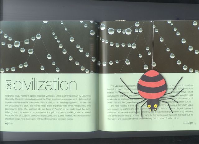
The last spread in Dixie's book is about the lost civilization of the Maya. The dewdrops were already there on the cobwebs, but I enhanced them with a bit of gold Pearl Ex mixed into Diamond Glaze. The spider was created by gluing a paper image to black Fun-Foam and giving him legs made of embroidery thread stiffened with PVA. He hands by a silver thread. The ancient Maya could calculate the orbits of the planets around the sun with an accuracy not equaled until modern times, yet their massive pyramids and palaces are now inhabited only by arachnids. How zen! Posted by Hello

Thursday, February 17, 2005


This is a larger view of the cover mentioned in the previous post. Posted by Hello

Reading Journal - "The Babes in the Woods"


The over-riding constant in this book was rain--so much rain that there hadn't been anything like it in Sussex in living memory. When two teenage siblings go missing along with their weekend chaperone, their rather unstable mother is convinced that they have drowned. Inspector Wexford feels certain that is not the case, but is at a loss as to what has actually happened to them. Eventually the woman who was supposed to be looking out for them, is found dead in her car in a ravine, but the weeks drag on without any sign of Sophie and Giles. All this time, we are finding out, bit by bit, just how dysfunctional their whole family is--as well as many bizarre facts about the dead woman. A fundamentalist-type religious group figures into the equation, as well as a very eccentric, pot-smoking granny. When the grandmother has a stroke, Sophie reappears, having called the EMTs, but she refuses to say where her brother is.

I had some of this mystery figured out even before the Inspector did, but he beat me to the identity of the actual murderer.

I decided to take one of Alberto Manguel's suggestions and improve my vocabulary by jotting down words I did not previously know, along with their definitions. These were Demesne, Virago, Etiolated, Distrait, Zeugma, Syllepsis, and the one that intrigued me the most was Simnel Cake. I went online to find a recipe, which I pasted into the small booklet on the right side. The cover for that was made by wetting a piece of Arches Text Wove paper and dropping on diluted Plaka paints and diluted Holbein Pearl Gold gouache. Then the wet paper was picked up and shifted around to get the colors to mingle. Of course, the scan doesn't do it justice, but in person it is so shimmery and beautiful. Posted by Hello

Monday, February 07, 2005

"A Song I Knew by Heart" by Bret Lott


This book is about the healing power of family. When Naomi's son dies and leaves his mother and wife bereft--awash in their individual and shared sorrows, they find strength in their love for each other. When Naomi suddenly decides to leave Massachusetts after 50 years and return to her childhood home in South Carolina, Ruth goes with her. They are welcomed by extended family, some of whom they barely know--and others not at all. They are flooded with a love they are nearly too fragile to accept.

Naomi is also dealing with the guilt she still feels after betraying her husband 40-odd years before. When she discovers that he had known all along and forgiven her anyway, she is at first devastated--but the knowledge of his forgiveness at long last allows her to forgive herself--and to permit Ruth to love again, too.

Here is a quote from Naomi:
"I felt all this, and knew suddenly and deeply and fully what it meant to be alive, because I seemed in this small moment so very far from it: to be alive was to be the one in bed and to have lived your life so that there would be someone beside you, someone there to hold your hand no matter the cold of it or the dead white skin and frail bones hiding underneath that skin. No matter the cluster of ghosts you carried with you every breath you took in. And to be alive was to live in a way such that you were both of these people: the comforted and the comforting, the loved and the loving, so that finally all you were, all that you had lived your life to become, the sum total of each sunrise and sunset you'd ever managed to witness, was to love. To live was to receive love, and to give it away."
 The images on this page are rubber stamps painted with Prismacolor pencils and outlined with a metallic gold gel pen. I've found that the chalky feel of the craft paints that I use on most of my backgrounds will destroy gel pens if used too extensively, but you can get away with using them in limited amounts.

Thursday, February 03, 2005

"A Death in Vienna" by Daniel Silva


I listened to this audio book on the way to Nacogdoches and was hoping it would last long enough to see me back home as well, but it concluded about the time I passed by the airport. I enjoyed it enough so that I got another book by Mr. Silva when I went to the library on Monday. When I checked online, I discovered that he has written 7 books in 7 years, and 3 of them comprise what he calls "an accidental trilogy dealing with the unfinished business of the Holocaust." This book happens to be the third one in the series, but it stands up well on its own.

Gabriel Allon is an Israeli agent whose alter ego--Mario Delvecchio--is an art restorer working in Venice. When a deadly bomb destroys the Wartime Claims and Inquiries office in Vienna, Gabriel is sent to investigate. His questions lead him to discover a Nazi war criminal with ties to the Vatican and the CIA. Ultimately, he learns of a (real) German secret operation called Aktion 1005 that was a plan to conceal evidence of the Holocaust by excavating millions of decomposing corpses and burning the remains. The specially created SS unit was so successful that even today pseudo-scholars and anti-Semites argue that the Holocaust was greatly exaggerated since the remains of 6,000,000 Jews can't be produced.

Reviewers compare Silva to John LeCarre and Graham Greene for his intelligently-wrought thrillers with important lessons to be learned and vital history to be remembered.

The capital "I" is a rubber stamp. I used Ranger's Archival Jet Black ink to stamp it, and it came out nice and crisp on the acrylic painted page. The picture on the opposite page shows a street scene in Vienna that I found online. The original picture was sepia-toned, but when I printed it out, it looked like a red negative because my printer had run out of black ink. But after I printed it out correctly, I decided to use the funky one after all. I sprayed the print with Krylon Workable Fixative and then wrote the title with black gouache and a # 2.5 Tape nib. The author's name was written with a # 6 Mitchell nib. I used a Uniball Vision micro pen for the text. Posted by Hello

Wednesday, January 26, 2005


This is a practice piece that I did in a calligraphy workshop this past weekend taught by Sharon Zeugin. The letters are sans serif Romans written with a Mitchell #6 nib using Winsor & Newton gold gouache (tube) with the tiniest drop of white gouache added to the mix. The paper is Canson Mi-Teintes, and the little drawing at the bottom is done with Prismacolor pencils. Roman capitals are notorious amongst calligraphers as probably the most difficult letters to execute properly. Once you are able to make each one reasonably well, the next hurdle is optical spacing. Most non-calligraphers don't appreciate how hard it is to learn to do these letters well because we've all been writing them since we were 5 years old. I've been actively studying calligraphy for about 20 years, including a number of Roman workshops with a variety of instructors, and I still feel like a novice when it comes to these letters. Posted by Hello

Tuesday, January 25, 2005

"Shoulder the Sky" by Anne Perry


I had previously read two other novels by this author; one featuring Inspector Monk and the second, Charlotte and Thomas Pitt. But this historical mystery I enjoyed more than either of those. It is set in 1915 before the U.S. entered WWI, during the time when England shouldered much of the burden in defending Europe from German aggression.

I listened to much of this unabridged audio version while traveling back and forth to the first weekend of Sharon Zeugin's 3-part workshop in Houston. I did not realize that this was the second book in a series until it abruptly ended without divulging the identity of the "Peacemaker". This master manipulator appeared to be an intimate of both the King and the Kaiser, and he sought peace at any price. His original plan would have allowed England to regain her American colonies in exchange for letting Germany have dominion over the rest of Europe. When this plot was discovered, and the war began anyway, he continued his machinations by using journalists to undermine public support for the conflict, and even going so far as to murder anyone, even a friend, who might threaten to expose him.

The main characters are the Reavley siblings: Joseph who is an army chaplain based in Flanders; Judith a volunteer ambulance driver; and Matthew an intelligence officer. Much of the story centers on Joseph's ethical need to find out who drowned an arrogant, thoroughly despicable reporter. He finally manages to solve this mystery--much to his sorrow--while also discovering that everything is not as black and white as he had once thought.

The author has done an excellent job of conveying the horror of the battlefield and also the comradeship of the ordinary soldiers. I'll be very interested to read future books in this series, as well as the one that came before this one--"No Graves As Yet".

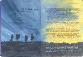
I had prepainted the background (the blue and yellow) weeks before I even began this particular book. I have just been using the pages in the journal in order as I finish a book, and so far I'm amazed at how each background seems to fit the book, but this one is so on target that it's positively eerie. I enlarged the silhouettes of the soldiers from those on the book cover and painted them with Americana brand "Graphite" acrylic paint. This was also used for the battlefield; just dabbing it on with a 1/2" flat brush to create the rubble. The black text was written with a new pen that I bought yesterday to try out. It is a Pentel EnerGel, and it worked great on the acrylic paint. The white text was written with a Gelly Roll pen. Posted by Hello

Friday, January 07, 2005


When the doors are opened, the burqa-clad women are revealed. The text underneath says, "but 500 years later, there's still this..." This was the last spread that I did in Dolores' book on women. Gee, I always thought the Dark Ages came before the Renaissance! Posted by Hello

The top text on this page says "Women have come a long way, baby..." The door was stamped and colored with chalk and blending fluid in a waterbrush. Posted by Hello

Wednesday, January 05, 2005

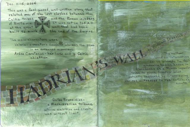
"Hadrian's Wall"


This was a fast-paced, well-written story that related one of the last clashes between the Celtic tribes and the Roman invaders of Britannia. It was set in 368 A.D. at the great wall that had been built to mark the end of the Roman empire. The main characters were:
     Valeria - a senator's daughter who was the pawn in an arranged marriage
     Arden Caratacus - her lover and a Celtic chieftain
     Galba Brassidias - a Machiavellian tribune whose ambition and cruelty was without limit

The author, William Dietrich, used an interesting device whereby the facts gradually become known in flashbacks as a Roman inspector tries to piece together what actually happened by interviewing various witnesses to the unfolding events.

Many years ago I began recording the title, author, and date of each book that I read. I put this into a Word table  so that I could sort it by each of those fields. I found this helpful to take with me to the library or bookstore when my short term memory got so bad that I couldn't remember whether or not I had already read something. Just a month ago, it occurred to me that I should start keeping a summary of the plot and my impressions of each book. I decided to do this in an art journal format in a composition notebook. The pages were first painted with a mixture of acrylic paints, and then I drew the wall with colored pencils and did the lettering with a .8 Copic Multiliner pen. The Celtic cross is a rubber stamp image. I had a lot of trouble getting this ready to post because it was too big for the scanner to read the whole spread. So I scanned the two halves separately and was struggling to learn enough about Photoshop to piece them together. A new online friend came to my rescue when she told me about the "stitching" capability in ArcSoft's PhotoStudio. Thanks, Janice! I didn't get it lined up absolutely perfectly, but it's close enough to suit me.
Posted by Hello

Tuesday, January 04, 2005

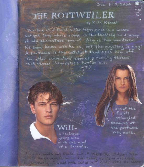
"The Rottweiler" by Ruth Rendell


This tale of a serial killer takes place in a London antique shop whose owner is the landlady to a group of odd characters, one of whom is the murderer. We soon know who he is, but the mystery is why ! A perfume is the catalyst that sets him off. The other characters' stories are a running thread that reveal themselves bit by bit. I never made any sense out of the title. It didn't seem to have any connection to the story at all--not even figuratively. I would have called it "Libido" after the scent.

This is the first page in my reading journal. The background was done with the cheapo acrylic paints that I love to use so much. When I first decided to start this journal, I went ahead and painted a bunch of spreads with random colors. I'm just using the pages in order as I finish a book. So far, the colors seem to go well with the mood/setting of the books. I'm beginning to learn that you don't have to plan every detail ahead of time. A little serendipity can be a wonderful thing. Because the background was dark, I used a white Prismacolor pencil for most of the writing, and the two people are cut from advertisements. Posted by Hello

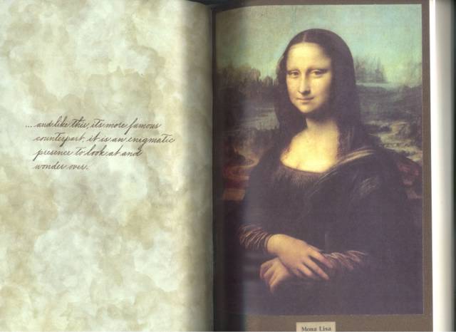
The fifth spread in the book has the text written on a piece of scrapping paper that was in the sale bin at Novel Approach. I think it goes so well with the sky that Leonardo painted. I love it when I am able to find the perfect piece of paper in my stash. Mona Lisa is adhered to a gorgeous piece of Stardream cardstock which is a rich brown with iridescent copper highlights. Unfortunately, it just looks dull in this scan.Posted by Hello

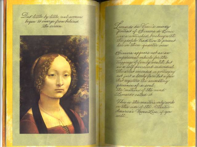
This is the 4th spread in the book. I painted these pages with Anita's Antique Gold acrylic paint, leaving some of the creamy white page showing. Then I wrote out the text on olive green scrapbooking paper and adhered the portrait of Ginevra de' Benci. Posted by Hello

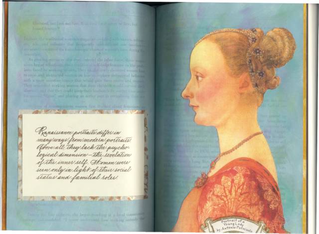
This is the third spread in the book. I painted the pages with robin's egg blue acrylic paint, and when that dried I swiped it with several colors of Colorbox fluid chalk ink pads. Then I cut out the woman's portrait and glued her in place. It doesn't show very well in the scan, but I mixed some very fine gold glitter with Perfect Paper Adhesive (matte), and dotted it around on her hair jewels and necklace with a toothpick. I was really surprised how great it looks. When you're looking at it in person, the necklace, especially, has a 3-D effect--like you could almost lift it off her neck. The writing was layered over a piece of mulberry paper that is printed with gold, silver, and copper. Posted by Hello

Monday, January 03, 2005


This is the second spread in Dolores's book. It illustrates how paintings of saints were the forerunners of Renaissance bridal portraits. Posted by Hello

This is the first spread I did in my friend Dolores' altered book. The topic I chose to share with her was how women were portrayed in Renaissance portraits, as well as how they were treated overall.  Posted by Hello